By Karen Fuller, Office Manager & Creative, Accent
There's a particular kind of design mistake that most people can't name but everyone can feel. A logo that looks slightly off. A headline that feels cramped in some places and gappy in others. A wordmark where two letters seem to be spaced unnaturally away from each other. Nine times out of ten, the culprit is kerning, or rather, the lack of it.
Kerning is one of those quiet disciplines that separates considered, professional design from work that's merely finished. Get it right and nobody notices, which is exactly the point. Get it wrong and, even if your audience can't articulate why, something about your brand reads as careless. In a world where your typography is often the first thing a visitor encounters, that's a first impression worth getting right.
I've spent the best part of three decades working with type in reprographics and design, and if there's one habit the job drills into you, it's looking, really looking, at the spaces most people skate straight past. Once you've had to spot a bad gap on a proof before it went to print, you can't switch that eye off. This article is an attempt to hand you a little of that eye.
What Is Kerning, Exactly?
Kerning is the adjustment of space between individual pairs of letters to achieve a visually even, harmonious result. The key words there are individual pairs. Kerning isn't about the overall spaciousness of a word, that's tracking, which we'll come to, it's about the specific, surgical relationship between one letter and its neighbour.
Here's why it's necessary. Every letter in a typeface is designed to sit within its own space, with a little built-in breathing room on each side. But letters are wildly different shapes. A straight-sided H occupies its box very differently from a round O, an angular A, or a T with its arms flung wide leaving a great cave of empty space beneath. When you place certain shapes next to each other, the built-in spacing falls apart. The classic offenders are pairs like AV, To, Wa, Ye and LT, where the shapes interlock awkwardly and leave gaps that look far too big.
Kerning is the craft of closing, or occasionally opening, those gaps so that every letter looks evenly spaced to the eye, even though the actual measured distances are all different. Because that's the secret: good kerning isn't mathematically equal spacing. It's optically equal spacing. Your eye is the instrument, not the ruler. It's a principle type foundries have understood for centuries; as the foundry Type Network and countless type designers put it, spacing is judged by the eye, not measured with a rule.
Kerning vs Tracking vs Leading: Clearing Up the Confusion
These three terms get muddled constantly, even by people who should know better. They're related, but they do different jobs, and knowing the difference is the first step to talking about type like a professional.
Kerning adjusts the space between a specific pair of letters. It's local and surgical. You kern the gap between the W and the a, not the whole word.
Tracking (sometimes called letter spacing, and it's the letter-spacing property in CSS) adjusts the space uniformly across a whole word, line or block of text. Tracking is the blunt instrument to kerning's scalpel. You might track out a short line of all-caps to make it feel more elegant and airy, or tighten the tracking on a large headline that would otherwise feel loose.
Leading (named after the strips of lead once used to pack the gaps between metal type, often called line height) is the vertical space between lines of text. Nothing to do with the horizontal relationships between letters, but it's the third member of the family and worth naming so you don't confuse it with the other two.
A simple way to remember it: kerning is between two letters, tracking is across many letters, leading is between lines.
Why Kerning Matters More Than You Think
You might reasonably ask: if fonts come with built-in spacing, and modern typefaces are professionally made, why do I need to worry about any of this? Three reasons.
It's Most Visible Exactly Where It Matters Most
Kerning problems scale with size. At body-text sizes, minor spacing quirks are invisible; the letters are too small for the eye to pick out individual gaps. But blow type up to headline size, or a logo, or a piece of hero text on your homepage, and every awkward pair is suddenly on display. The larger and more prominent the type, the more kerning matters. And the largest, most prominent type on your site is almost always the type carrying your brand.
Bad Kerning Reads as Carelessness
People rarely diagnose kerning consciously, but they absolutely register its effects. Uneven spacing makes a wordmark feel unbalanced, an interface feel unpolished, a brand feel like it didn't sweat the details. And if you didn't sweat the details on the one word you show everyone, your own name, what does that say about the care you'll take with a client's project? Typography is a trust signal, and kerning is a big part of it. This is the same argument we made in Why Typography Is the Most Important Design Decision on Your Website; the details aren't decoration, they're the message.
It's the Difference Between "Nice Font" and "Good Typography"
Choosing a beautiful typeface is the easy part. Setting it well is the craft. A gorgeous typeface, badly kerned, looks worse than a plain one set with care. This is why two designers can use the identical font and produce results that feel worlds apart. The font is the raw material; kerning is the craftsmanship.
The Usual Suspects: Letter Pairs That Cause Trouble
Some combinations cause problems again and again because of the shapes involved. If you learn to watch for these, you'll catch the majority of kerning issues before they publish:
- Capital-to-lowercase transitions after angular caps:
Ta,Va,Wa,Ya. The diagonal or overhanging cap leaves a gap above the lowercase letter that reads as too wide. - Diagonal pairs:
AV,AW,VA,AY. Two slopes pointing away from each other create a cavern in the middle. - Anything next to a
T,ForL: these letters have big pockets of empty space.LT,Te,Fo. - Round-to-round and round-to-straight:
oc,co, sometimes need subtle tightening. - Punctuation: quotation marks, apostrophes, and full stops next to certain letters frequently need attention, especially in headlines.
- Numbers, particularly
1and7, which often carry unusual amounts of surrounding space.
The all-caps combination that trips up the most logos? The humble AV and its relatives. Once you've seen a badly kerned AV, you'll never unsee it.
To show you what I mean, I've set the same word twice below, identical typeface (Geist), size and colour, with spacing the only thing that changes. The left 'Wave' shows how Figma spat it out; the right 'Wave' is the same word after I've worked through it pair by pair. It's the exact process I'd run on any piece of display type before signing it off.
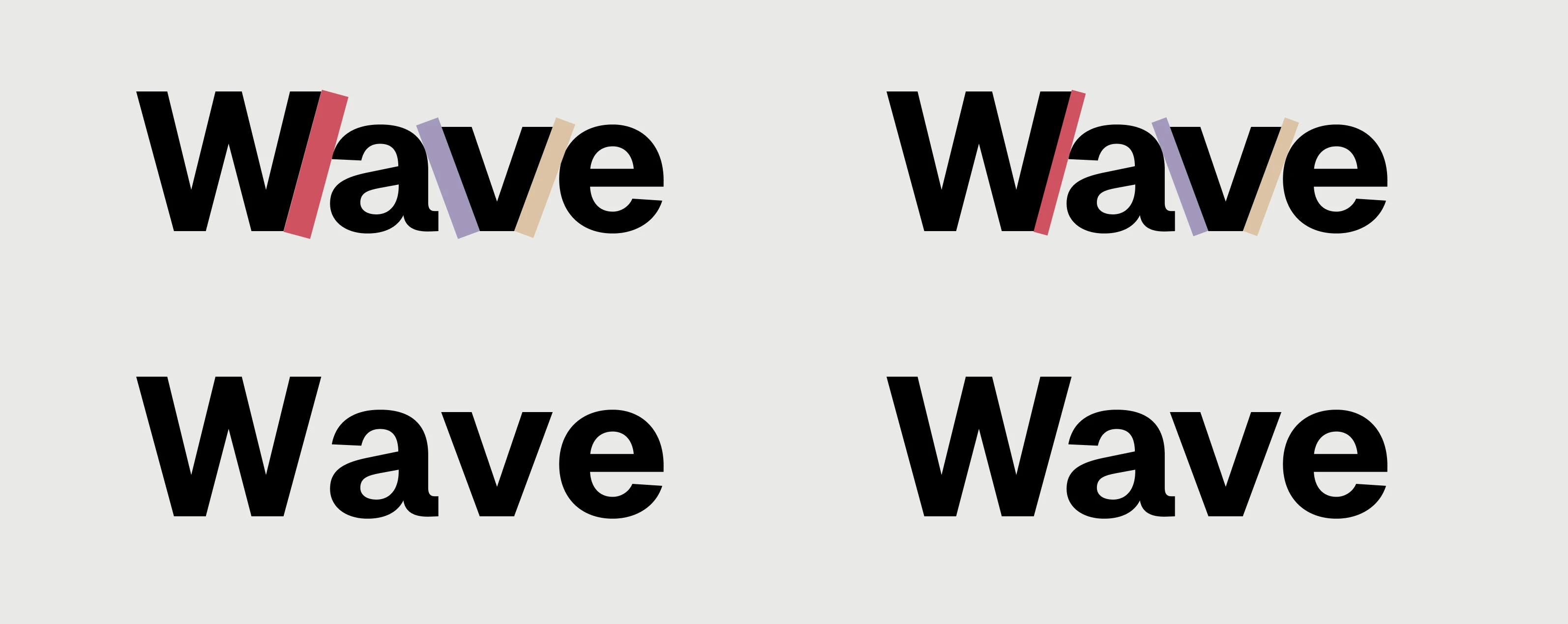
Set in Figma. The same word, same typeface (Geist); the only difference is the spacing. The left 'Wave' leaves your eye tripping over uneven gaps; the right, once I'd kerned it, reads as a single settled unit.
How to Actually Kern: A Practical Approach
Kerning sounds fiddly, and at the finest level it can be, but the working method is simpler than people expect. Here's how designers approach it.
Trust Your Eye, Not the Numbers
The golden rule: kern by eye, not by measurement. The goal is optically even spacing, and only your eye can judge that. Two tricks help enormously. First, squint at the word; blurring your vision collapses the letters into tones and rhythm, and uneven gaps jump out as darker or lighter patches. Second, do what artists and photographers do and flip it upside down. Making the word unfamiliar stops your brain from reading it and lets you see it purely as shapes and spaces, which is where the problems live.
The "Rhythm of Space" Principle
Think of the spaces between letters as needing to hold a roughly equal amount of light, not an equal distance. Because letters are different shapes, equal distances produce unequal-looking gaps. You're aiming for an even visual rhythm across the whole word, a steady drumbeat of space, not a lurching one. Work through a word pair by pair, always comparing each gap to the ones on either side.
Kern in Context
Kern at the size, colour and background you'll actually use. Spacing that looks right in black on white at 200px can look quite different reversed out of a dark background, or scaled down onto a business card. (Speaking of which, dark backgrounds bring their own subtleties; we went deep on those in Black Is Not the Only Black.)
Don't Over-Kern
A word of caution. Once you start seeing kerning problems, you see them everywhere, and there's a temptation to tighten everything until the letters are practically touching. Resist it. Over-kerned type is just as hard to read as under-kerned type; the letters collide and lose their individual identity. The goal is even, not tight. Good kerning is invisible; aggressive kerning draws attention to itself.
Kerning on the Web: What's Different
Print designers have total control over every letter. On the web, it's more nuanced, and worth understanding if your brand lives online.
The good news is that modern browsers and quality web fonts do a lot for you automatically. Most professional typefaces ship with built-in kerning data, tables that tell the browser how to handle troublesome pairs, and you can switch this on with the CSS font-kerning property, which is applied by default in most modern browsers. There's also text-rendering: optimizeLegibility, which asks the browser to favour kerning and ligatures, handy on headings, though its exact behaviour varies between browsers and it's best kept off long passages of body text, where it can carry a small performance cost. Treat it as a finishing touch on display type rather than a site-wide switch.
For body text, that automatic handling is genuinely all you need, and manually kerning flowing paragraphs of web text is neither practical nor wise, since text reflows across different screen sizes. Where hands-on control earns its keep is the same place it always does: large display type, headlines and, above all, logos. For a logo, you're not really relying on live web text at all; you're placing a carefully crafted piece of artwork (usually an SVG), where every pair has been kerned to perfection and locked in place. That's the one piece of type on your whole site that deserves manual, obsessive attention.
The principle for the web, then, is this: let the browser handle the small stuff, and reserve your kerning energy for the big, brand-defining moments where it shows.
The Takeaway
Kerning is a small thing that isn't small at all. It's the difference between type that reads as effortless and type that quietly undermines you. It's mostly invisible when it's right, which is why it's so easy to neglect, and so powerful when you don't.
You don't need to become a kerning obsessive to benefit from it. You just need to start seeing it: to notice the gappy AV in a logo, the cramped headline, the wordmark that doesn't quite sit still. Once you can see it, you can fix it. And once you fix it, your work carries that quiet mark of care that audiences feel even when they can't name it.
The next time you set a headline or sign off a logo, pause on the spaces. Squint at it. Turn it upside down. Ask whether every letter is genuinely at home next to its neighbours. Your typography, and your brand, will be all the better for it.
Karen Fuller is the office manager and creative of Accent, based in Norwich. She has worked in the reprographics and photography industries for 27 years, and holds a degree in fine art and qualifications & awards in photography and design.