By Karen Fuller, Office Manager & Creative, Accent
There is a quiet confidence to a brand that trusts its name to do the work. No icon, no abstract swoosh. Just letters, set with intention, speaking on behalf of everything a business stands for. A typographic logo, or wordmark, is among the most enduring and strategically powerful choices in brand identity design, and in 2026 the wordmark is having a significant cultural moment.
As a designer who came through art school, print reprographics, and finally agency practice, I have come to appreciate wordmarks not as the easy option, but often as the most demanding one. When there is no illustration to hide behind, every spacing decision, every weight choice, every curve of a letterform is exposed to scrutiny. Getting a wordmark right requires rigour. Getting it wrong is very visible.
Why a Wordmark Can Define a Brand on its Own
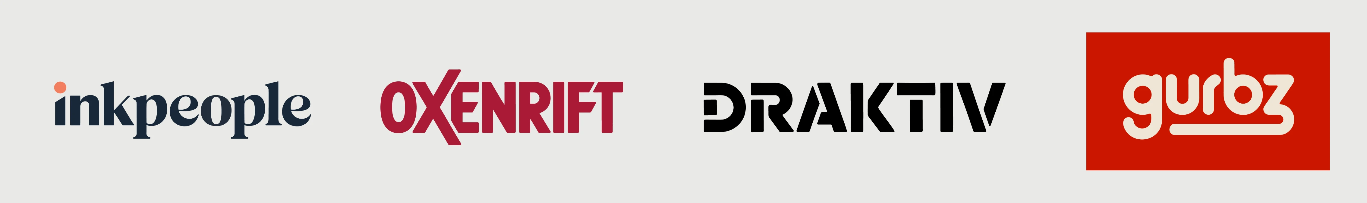
The wordmark has an impressive pedigree. Coca-Cola has barely changed its script logo in over a century. Google has built one of the most recognised identities on earth from a simple sans-serif name. Visa, Canon, and Sony are each proof that a well-chosen typeface, applied with consistency, can carry extraordinary brand equity over time.
Research suggests that over 40% of the world's top global brands, including giants such as Visa and FedEx, use wordmarks, precisely because the approach drives instant name recall. The logic is elegant: every time someone encounters the logo, they are also reading the brand name. For newer businesses particularly, a typographic logo builds recognition faster than an abstract symbol ever could.
A wordmark is the right choice when you want your brand name front and centre, when the name itself is distinctive or memorable, when you are aiming for a minimalist or modern look, and when you need something versatile enough to scale from packaging to a website header to an embroidered garment.
The argument for typographic logos is also a practical one. In a world where logos must function across a smartphone notification icon, a billboard, a branded tote bag, and a favicon simultaneously, simplicity is not a compromise; it is a requirement.
How We Approach Wordmark Design at Accent
Before a single font is considered, the work is research. At Accent, we follow a consistent discovery process that begins well before we open any design software.
Step one: Understand the sector
Every industry carries visual conventions, and a designer's first responsibility is to understand them. Is this a sector where trust and authority are paramount, such as financial services or legal? Does it demand warmth and approachability, as in hospitality or consumer goods? Is it a space where innovation and disruption are values to communicate, as in technology or creative services?
Serif wordmarks tend to use letterforms with small finishing strokes, giving them a traditional and authoritative feel. Brands in legal, publishing, and luxury sectors often choose serif typography to communicate trust, heritage, and professionalism. Sans-serif wordmarks, by contrast, remove decorative strokes for a clean, contemporary appearance, making them a popular choice for technology companies, SaaS platforms, and startups.
Understanding the sector also means understanding the competitive landscape. A typographic logo that looks identical to its nearest competitors has failed at differentiation, regardless of how well-crafted the individual letterforms are.
Step two: Establish the brand personality
Modern or traditional? Bold or refined? Accessible or exclusive? These are not superficial questions. They determine the entire typographic direction. A challenger brand that wants to feel energetic and confident will point towards very different typefaces than a heritage business seeking to communicate reassurance and experience.
To ensure harmony between a wordmark's font and the wider brand identity, a designer must first identify the core values and mission of the brand and the demographic of its audience.
Step three: Explore typographic style and weight
Only once sector and personality are understood should typeface exploration begin. The principal categories of typography each carry distinct emotional associations:
Serif typefaces bring heritage, authority, and elegance. Display or condensed sans-serifs communicate urgency, modernity, and confidence. Geometric sans-serifs feel precise and considered. Thin, widely-tracked letterforms suggest luxury and restraint. Monospace or technical typefaces suggest engineering, systems, and rigour. Script or italic treatments suggest individuality, warmth, and creativity.
Step four: Interrogate the details
The difference between a good wordmark and a great one often lives in the details that most people will never consciously notice. Kerning, the spacing between individual letters, must be considered character by character, not set and forgotten. Custom modifications to individual letterforms, a subtly extended crossbar, a slightly unusual terminal, a deliberate ligature between two characters, transform a typeface into a truly proprietary mark that cannot simply be replicated by downloading a font file.
Custom ligatures, the combination of two or more letterforms into a single character, can add a distinctive flair to a wordmark, and meaningful connections between letters can be used to emphasise certain parts of the name or create subtle visual metaphors.
Step five: Consider colour with purpose
Colour in a wordmark carries significant psychological weight. The choice must reinforce the brand personality established in earlier research rather than be made on aesthetic preference alone.
In 2026, the stronger shift is not necessarily towards new colours but towards systems: a stable base palette with one standout accent that becomes recognisable over time. For typographic logos, this discipline is especially important. A wordmark that relies on unusual colour combinations to feel distinctive is a mark that will become invisible the moment it appears in a context where colour cannot be used.
Where Wordmark Design Is Heading in 2026
The wider design landscape in 2026 is characterised by a productive tension between technological polish and deliberate human imperfection. Typography is increasingly the hero rather than a supporting element. Letterforms are becoming UI, diagrams, and expressive devices simultaneously, with type moving from a neutral carrier to the main character of a brand's visual identity.
Another defining trend is the rise of typography as the primary brand signal, with icons becoming secondary while wordmarks take centre stage. More brands are investing in custom type as a strategic asset rather than a decorative choice.
At the same time, there is a growing resistance to the sterile perfection that characterised a great deal of brand design in the previous decade. Designers are deliberately introducing friction and noise into type choices as an effective way to signal an authentic perspective, with typography being used as rebellion, a refusal to sand down every rough edge in pursuit of algorithmic perfection.
The strongest identities of 2026 are not defined by software or templates but by intent. Designers are thinking in systems and building flexibility into marks, prioritising emotional connection alongside usability.
For wordmarks specifically, minimalist logos are evolving towards sharper contrast, bolder typography, and more confident use of negative space. The safe minimalism of previous years is being replaced by high-impact minimal design.
Variable fonts are also changing what is possible within a single typographic identity. A wordmark built on a variable font can adapt its weight and width across contexts, heavier in a headline, lighter in a footer, compressed in a tight layout, while remaining unmistakably itself. This addresses one of the longstanding practical challenges of typographic logos: their need to perform consistently across wildly different formats and sizes.
A Word on Our Own Wordmark
It would be remiss to write about typographic logo design without acknowledging the identity that has represented Accent for many years.
The Accent wordmark is, at its heart, a combination mark that illustrates several of the principles discussed above. The custom letterforms, particularly the modified 'a' with its angular cut and the fluid, wide curves of the remaining characters, give the wordmark a proprietary quality that no font file could replicate. The 'a' accent has been defining for Accent since the 1990s. The integration of the folded accent device into the opening of the 'a' does something clever: it provides a pictorial anchor without ever competing with the letterforms themselves. The two elements are inseparable.
Charcoal grey is a considered choice. It carries the authority of black without its severity, suggesting a studio that takes its work seriously without taking itself too seriously. The lime and muted khaki of the accent introduce energy and a contemporary feel, and their contrast against the dark type gives the mark presence on any background.
The tagline "Creative Digital Solutions", set in widely tracked capitals beneath the wordmark, completes the identity with clarity. It does not attempt to be clever. It tells you exactly what Accent does, in a typographic style that reinforces the considered, professional character of the primary mark.
Underneath the whole thing is a philosophy we apply to every project: type is not decoration. It is communication. When it is chosen and crafted with care, a wordmark can do everything a logo needs to do, and do it with a longevity that no trend cycle can easily disrupt.
Wordmark Logo FAQs
What is a wordmark?
A wordmark is a logo made entirely from the name of the brand, set in a distinctive typeface. Unlike a combination mark or a pictorial logo, a wordmark contains no separate icon or illustration. Google, Visa, and Coca-Cola are all examples of wordmark logos.
What is the difference between a wordmark and a logo?
A wordmark is a specific type of logo. The word "logo" is an umbrella term that includes pictorial marks (such as the Apple icon), abstract marks (such as the Nike swoosh), combination marks that pair type with a symbol, and wordmarks that use type alone. Every wordmark is a logo, but not every logo is a wordmark.
When should I use a wordmark rather than an icon-based logo?
A wordmark is usually the right choice when the brand name is short, distinctive, or in need of recognition. It is particularly effective for newer businesses still building name awareness, for businesses that want to feel modern and minimalist, and for brands that will appear in many different formats where a complex icon might not reproduce well. If your name is long or awkward, a combination mark or lettermark may serve you better.
Are wordmark logos still effective in 2026?
Yes, and arguably more so than in previous years. Typography is increasingly taking centre stage in brand identity, with many leading brands investing in custom type rather than decorative icons. A well-crafted wordmark also performs better than ever across modern contexts, from favicons to variable-font web typography.
What makes a wordmark logo look professional?
Three things, reliably: a typeface chosen with intent for the sector and personality of the brand; careful custom kerning and letterform modifications that move the mark beyond a simple font file; and disciplined use of colour so the wordmark remains legible across every context in which it will appear.
Work with Accent on Your Wordmark
Whether you are launching a new brand or revisiting an identity that no longer fits, a well-crafted wordmark is one of the soundest investments a business can make in its visual identity. At Accent, our team has been designing brand identities and logos for businesses across the UK since 1990.
If you are considering a new typographic logo, or simply want to explore whether a wordmark is the right direction for your brand, get in touch for an initial conversation.
Karen Fuller is the office manager and creative of Accent, based at the Enterprise Centre, University of East Anglia. She has worked in the reprographics and photography industries for 27 years, and holds a degree in fine art and qualifications & awards in photography and design.