Most of what users do on your website is read. Product descriptions, blog posts, forms, navigation menus - typography is the primary interface between your content and your audience. Yet for years, it was treated as an afterthought, squeezed between flashy visuals and complex interactions.
That's changing. As web design matures, there's a growing appreciation for the fundamentals, and nothing is more fundamental than how text looks and reads. Great typography guides users, establishes hierarchy, reinforces brand identity, and makes content accessible to everyone. It's not decoration; it's infrastructure.
How We Got Here
In the early days of the web, designers were limited to "web-safe" fonts: Arial, Times New Roman, Georgia, Verdana. Web pages looked like Word documents. Then services like Google Fonts and Adobe Fonts liberated designers from system fonts, and thousands of typefaces became available overnight. Designers went wild, often cramming four or five fonts onto a single page. It was typographic chaos, but it was exciting.
Now, we've reached a more considered era. Variable fonts - single files that contain multiple weight, width, and style variations - offer unprecedented flexibility without the performance penalty of loading multiple font files. CSS has evolved to give designers fine-grained control over spacing, sizing, and rendering. And critically, there's a renewed focus on readability and accessibility over novelty.
Typography as a Branding Tool
Your brand isn't just your logo; it's every interaction users have with your business, and typography is a significant part of that. The typefaces you choose communicate personality and values before anyone reads a single word.
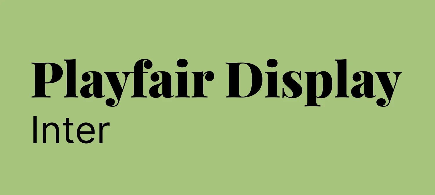
Serif fonts like Playfair Display or Merriweather convey tradition, elegance, and authority. Sans-serif fonts like Helvetica, Futura, or Inter feel modern, clean, and approachable. Display fonts like Bebas Neue make bold statements in headlines and hero sections, though they're not suited to body text. Monospace fonts like JetBrains Mono carry a technical, contemporary edge that works well for developer-focused brands.
The key is choosing typography that aligns with your brand's personality and applying it consistently across every touchpoint - website, emails, marketing materials, and social media. When users encounter your distinctive type treatment repeatedly, they begin to associate that visual style with your brand. That consistency builds recognition.
At Accent, we help clients choose typography that tells their brand story. We consider target audience, industry context, competitor differentiation, and long-term scalability. The fonts you choose today should still feel right in five years.
Getting Readability Right
If users can't read your content comfortably, nothing else matters. You could have the most beautiful website in the world, but if the text is too small, the line height is cramped, or the colour contrast is poor, users will leave. Here are the fundamentals.
Font size. Body text should be at least 16px on desktop and 18px on mobile. The larger mobile size accounts for the closer viewing distance and smaller physical screen. Headings should be significantly larger to establish clear hierarchy. A modular scale helps here: if your body text is 18px, your H3 might be 24px, your H2 32px, and your H1 48px or larger.
Line height. A ratio of 1.5 to 1.8 times the font size works well for body text. For headings, 1.2 to 1.3 is usually sufficient since they're shorter and larger.
Line length. The ideal measure is 50 to 75 characters per line, roughly 10 to 12 words. Longer lines cause eye fatigue; shorter lines feel choppy. Use max-width on text containers to keep this optimal, even on wide screens.
Colour contrast. WCAG AA standards require a contrast ratio of at least 4.5:1 for normal text and 3:1 for large text. Light grey text on a white background might look elegant, but it's often inaccessible. Tools like WebAIM's Contrast Checker make verification straightforward.
Font weight and spacing. Use varied weights strategically to establish hierarchy rather than making everything bold or everything light. For body text, trust the default letter spacing - type designers spend years perfecting it. For all-caps headlines, a slight increase in tracking can improve legibility.
Alignment. Left-aligned text is easiest to read for Western languages. Centre alignment works for short passages like quotes or hero text but becomes difficult for longer content. Justified text creates awkward word spacing on the web; it is generally best avoided unless you are implementing proper hyphenation.
Variable Fonts: A Genuine Game-Changer
Variable fonts deserve particular attention. Instead of loading separate files for regular, bold, italic, and other variations, a single variable font file contains all variations along one or more axes - weight, width, slant, optical size, and even custom axes.
The practical benefits are significant. Performance improves because one file replaces four or five, reducing bandwidth and boosting Core Web Vitals scores. Flexibility increases because you're no longer limited to preset weights like 400 and 700 - a weight of 550 is just as easy to use. Responsive design benefits because typography can scale fluidly across screen sizes, with headings at weight 800 on mobile transitioning smoothly to weight 600 on desktop where the larger rendering doesn't need as much boldness.
Popular variable fonts include Inter, Roboto Flex, and Source Sans Variable, all available through Google Fonts and Adobe Fonts.
Typography and Accessibility
Typography is a fundamental accessibility concern. Users with visual impairments, dyslexia, or reading difficulties depend on well-chosen, properly implemented type to access your content. According to the World Health Organisation, roughly 16% of the global population - around 1.3 billion people - live with some form of disability. Getting typography right extends your reach to a significant audience.
Good accessible typography means sufficient size with layouts that don't break when text is resized; properly structured headings (H1, H2, H3) that help screen reader users navigate efficiently; adequate contrast between text and background; and responsive line lengths that prevent reading fatigue across devices. OpenType features like proper ligatures and numerals also contribute to readability, and fonts designed specifically for legibility - such as Atkinson Hyperlegible, developed by the Braille Institute - are becoming increasingly popular.
At Accent, we meet and exceed WCAG AA standards in every project. We test colour contrast, validate heading structures, and ensure text remains readable when zoomed to 200%. Accessibility isn't optional; it's a core principle of good design.
Making Typography Perform
Every font file you load adds to your page weight. Typography that looks wonderful but slows your site down is working against you. A few practical steps make a significant difference.
Use variable fonts to replace multiple files with one. Subset your fonts so you're only loading the character sets you actually need - if your content is in English, there's no need to load Cyrillic or CJK glyphs. Tools like Glyphhanger can generate optimised subsets. Preload critical fonts using <link rel="preload"> for anything above the fold. Use system fonts for UI elements - system font stacks like -apple-system or BlinkMacSystemFont render instantly with zero load time. And limit your font weights - in most cases, regular and bold are sufficient.
Optimised typography contributes directly to faster load times, better Core Web Vitals scores, and improved SEO. Google prioritises fast, accessible, well-structured sites, and quality typography ticks all of those boxes.
Trends Worth Watching
A few current trends are proving genuinely useful rather than merely fashionable. Oversized typography in hero sections creates immediate impact when paired with generous whitespace and proper mobile scaling. Typography-as-visual-element - where creative type arrangements replace imagery - produces fast-loading, endlessly flexible designs. Purposeful typeface mixing (typically a serif for headings with a sans-serif for body, or vice versa) adds visual richness when each face serves a clear role. And minimal, text-focused layouts that strip away clutter and let typography breathe align well with both sustainable web design principles and better user experience.
The Business Case
Investing in quality typography delivers measurable returns. Readable text keeps users on the page longer and increases the likelihood they'll complete forms, read product descriptions, and follow calls to action. Accessible typography opens your content to a wider audience. Distinctive type treatment strengthens brand recognition. And optimised font loading contributes to faster sites - where even a 0.1-second improvement can lift conversion rates.
Typography isn't a nice-to-have; it's fundamental to effective web design.
What to Do Next
Whether you're building a new site or refreshing an existing one, a typography audit is a practical place to start. Check your font sizes, line heights, and contrast ratios. Test on real devices. Establish a type scale. Limit your font choices to two or three that complement each other and serve distinct purposes. Use semantic HTML so your heading structure supports both screen readers and search engines.
If you'd like expert guidance, we'd be happy to help. At Accent, we've spent over 30 years refining the art and science of design, and typography is central to everything we create. Get in touch to talk about how better typography could transform your website.