Since white is the colour of the year ... we began to think about the other end of the tonal spectrum in digital design. It's all too easy to reach for #000000 and call it a day, but here's the thing, pure black isn't always the best choice for creating sophisticated, professional designs. Just as print designers have long understood the power of rich blacks and carefully crafted dark tones, digital designers need to embrace the nuanced world of "not quite black."
The Problem with Pure Black
Pure black (#000000) might seem like the obvious choice, but it can appear harsh and flat on screen, particularly against lighter backgrounds. It lacks depth and can create uncomfortable contrast levels, especially for extended reading. In the real world, true black is actually quite rare—shadows contain hints of blue, surfaces reflect surrounding colours, and even the darkest objects have subtle tonal variations.
Rich Blacks: Lessons from Print
Print designers have been using rich blacks for decades. In CMYK printing, a rich black combines all four ink colours to create a deeper, more luxurious black than using 100% black ink alone. This same principle translates beautifully to digital design.
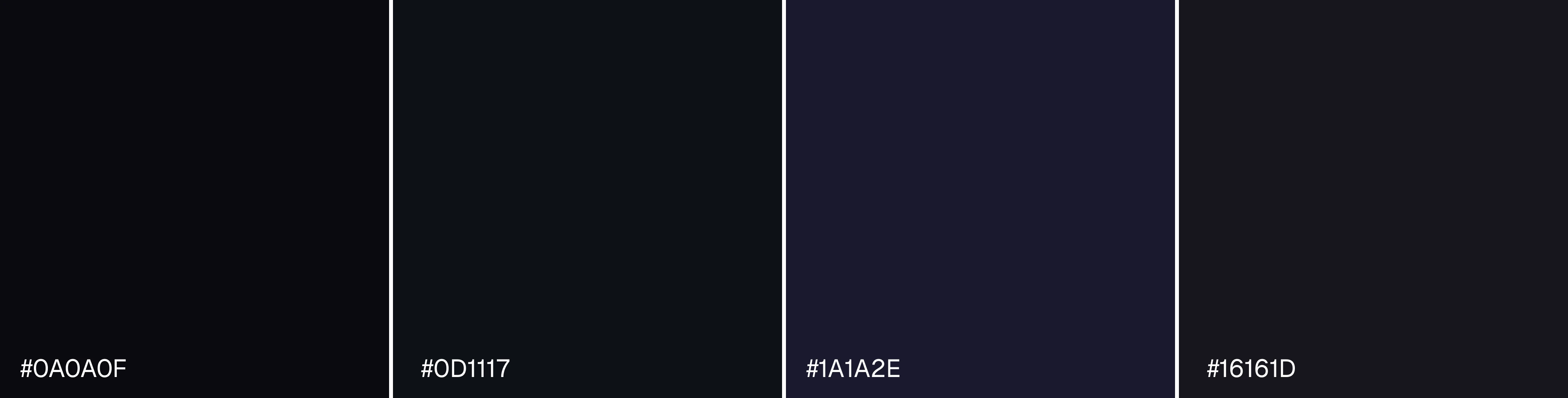
Cool Rich Blacks
Adding blue undertones creates sophisticated, professional blacks perfect for corporate and tech interfaces:
#0A0A0F- A deep blue-black with subtle coolness#0D1117- GitHub's signature dark background#1A1A2E- A midnight blue-black ideal for dark mode interfaces#16161D- Perfect for creating depth in UI elements
These cool blacks work brilliantly for technology brands, financial services, and anywhere you want to convey trust and professionalism.
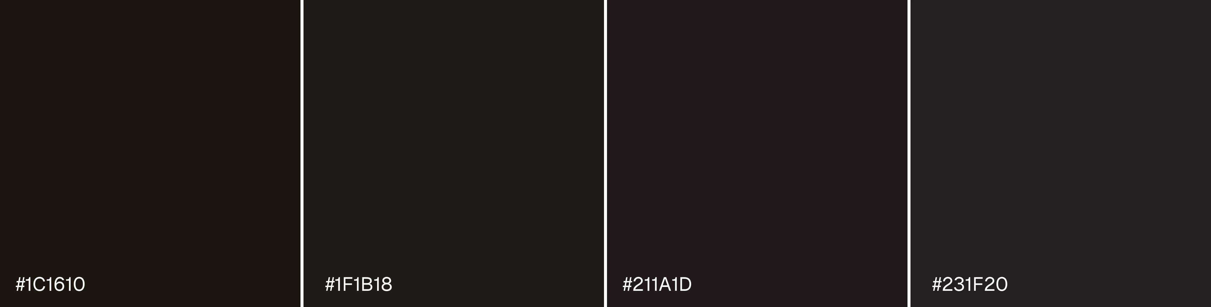
Warm Rich Blacks
Red and brown undertones bring warmth and approachability:
#1C1610- A warm, almost sepia-toned black#1F1B18- Brown-black excellent for luxury brands#211A1D- Burgundy-tinted black for elegance#231F20- Adobe's near-black with subtle warmth
Use these for hospitality, fashion, food and beverage brands, or anywhere you want to create a welcoming, premium feel.
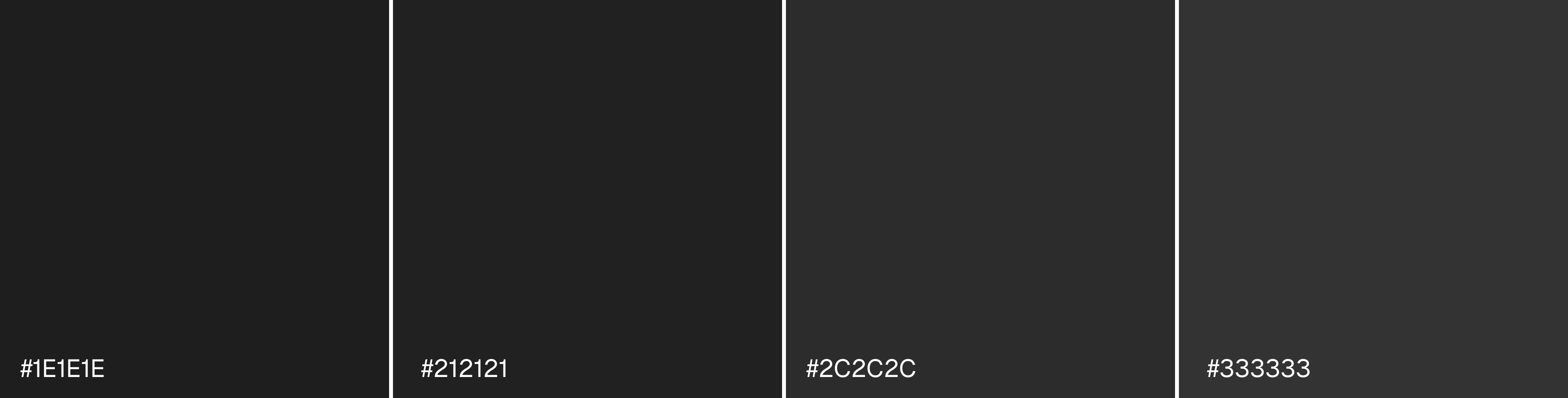
Grey-Blacks: The Sweet Spot
Sometimes the best "black" isn't black at all. These charcoal and grey-black tones offer excellent readability whilst reducing eye strain:
#1E1E1E- A soft, neutral dark grey#212121- Google's Material Design dark surface#2C2C2C- Ideal for backgrounds in dark mode#333333- A popular choice for body text
These tones work exceptionally well for typography, particularly in dark mode interfaces, where they provide sufficient contrast without the harshness of pure black.
Practical Usage Examples
Website Backgrounds
Instead of #000000, try #0D1117 for a sophisticated tech website or #1C1610 for a luxury brand. The subtle colour cast adds depth and makes other design elements pop.
Typography
For body text on white backgrounds, #333333 or #2C2C2C provides better readability than pure black. Your users' eyes will thank you during longer reading sessions.
UI Elements
Navigation bars, headers, and footers benefit enormously from rich blacks. Try #1A1A2E for a modern tech aesthetic or #211A1D for something more refined.
Shadows and Depth
Create realistic shadows using dark blues like #0A0A0F at low opacity rather than pure black. This mimics how shadows actually appear in nature.
Dark Mode Design
When designing dark mode interfaces, never use pure black. Opt for #1E1E1E or #212121 as your base, with even lighter greys for elevated elements. This creates a hierarchy and reduces eye strain.
Choosing the Right Black
Breaking free from #000000 opens up a world of sophisticated design possibilities. Whether you're creating a website, mobile app, or digital brand identity, the right black can elevate your work from functional to exceptional. Rich blacks add depth, grey-blacks improve readability, and carefully chosen dark tones create the perfect atmosphere for your brand.
So next time you're about to reach for that pure black, pause and consider: what kind of black does your design really need? The answer might just transform your work.