By Karen Fuller, Office Manager & Creative, Accent
Ask ten people to describe the difference between a serif and a sans serif font and most will get there eventually, one has little feet, the other doesn't. That's true, as far as it goes. But it's rather like saying the difference between a violin and a cello is that one's bigger. Accurate, and almost entirely beside the point.
The real question isn't what the difference is. It's what that difference does, to how your words are read, to how quickly they're understood, and to what your brand quietly signals before a single sentence has been consciously processed. Choosing between serif and sans serif is one of the earliest and most consequential decisions in any piece of design, and it deserves rather more thought than "which one looks nicer".
First, the Actual Difference
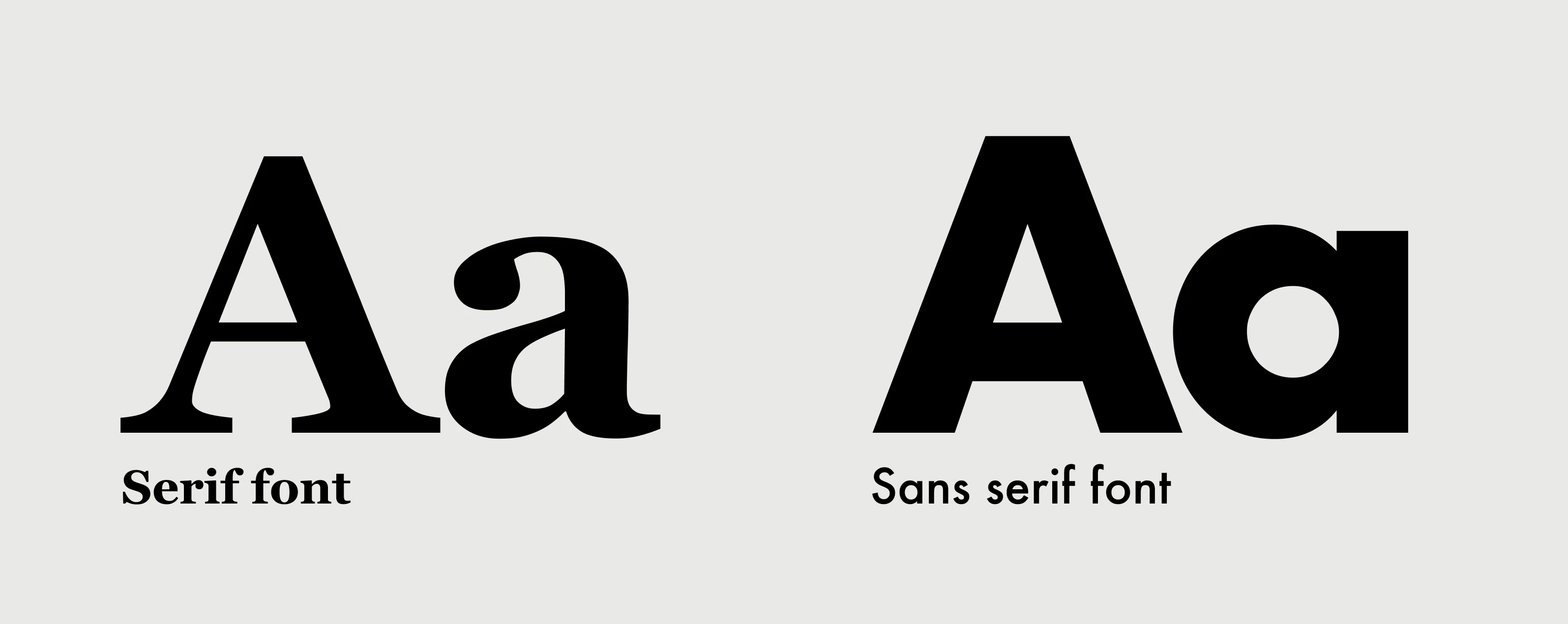
A serif is the small stroke or "foot" that projects from the end of a letter's main strokes. Serif typefaces, think Times New Roman, Garamond, Georgia, carry these finishing details. The style is old; it descends from the chisel marks of Roman stonecutters and the pen strokes of early scribes, which is partly why serifs still carry an air of tradition and permanence.
A sans serif typeface is simply one without those feet ("sans" being French for "without"). Helvetica, Arial, Futura and their many relatives strip the letterforms back to clean, unadorned lines. Sans serifs are the younger family, rising to prominence in the 20th century alongside modernism, and they still tend to read as clean, modern and efficient.
That's the anatomy. Here's what it means in practice.
What Each One Says About You
Type has a voice before it has a message. Long before a reader has taken in a word, the shape of your letters has already set a tone. This is the part most "little feet" explanations miss entirely, and it's the part that matters most for branding.
Serifs tend to say: established, trustworthy, traditional, editorial, refined. They carry centuries of books, newspapers and institutions behind them. Reach for a serif when you want to feel authoritative, heritage-rich or intellectually serious, law firms, universities, luxury goods, long-form journalism. A serif says "we have been here a while, and we know what we're doing".
Sans serifs tend to say: modern, clean, approachable, efficient, straightforward. They feel contemporary and unfussy. Reach for a sans serif when you want to feel current, accessible or technologically confident, software, startups, healthcare, most modern web interfaces. A sans serif says "we're clear, we're easy, we're now".
These are tendencies, not laws, and the interesting work often happens when you play against them. A tech company using a serif can feel refreshingly grown-up in a sea of identikit sans-serif competitors. A heritage brand using a clean sans serif can feel like it has confidently stepped into the present. The point isn't to obey the stereotype; it's to know it, so that whichever way you go is a choice rather than an accident.
The Legibility Question (and the Myth That Won't Die)
Here's a claim you'll have heard: serifs are more legible in print, sans serifs are more legible on screen. It's repeated everywhere, and it's mostly a relic.
The origin is real enough. Early, low-resolution screens simply couldn't render fine serifs cleanly, the feet turned to mush, so sans serifs, with their simpler shapes, held up far better. On the coarse displays of the 1990s and 2000s, that genuinely mattered.
But screens have moved on enormously. High-density displays now render a delicate serif as crisply as any printed page, and plenty of serif typefaces are designed specifically to thrive on screen (Georgia was an early example, drawn expressly for the purpose). The old rule has quietly expired, even if the internet hasn't noticed.
But the Medium Still Matters, Just for Subtler Reasons
Retiring the old rule doesn't mean print and screen are interchangeable. They're physically different reading experiences, and once you understand why, you can make a far better-informed choice than "serif for paper, sans for pixels" ever allowed.
The most fundamental difference is the nature of the light. Print is reflective: ink sits on paper and you read by light bouncing off the page towards your eye. A screen is emissive: you are looking directly into a light source. Reading into emitted light is measurably more tiring over long stretches, which is one reason a settled, hour-long read still feels more comfortable in print, and why the serif's habit of gently guiding the eye along a line arguably earns its keep more there. It's also why "dark mode" exists at all, reducing the amount of light thrown at the reader, a consideration that simply has no equivalent on paper.
Then there's resolution and permanence. Ink on paper is effectively infinite-resolution and completely fixed: the finest hairline serifs and the dramatic thick-to-thin stroke contrast of a display face like Bodoni or Didot reproduce flawlessly, at any size, exactly as you set them. Those high-contrast serifs can look genuinely exquisite in print. On screen, that same delicacy is at the mercy of the device. The thin strokes can thin out, shimmer or drop below a pixel at small sizes, and crucially, you don't control the conditions. The same font is rendered differently across operating systems, browsers, screen densities and user settings. Print is set once and locked; screen type has to survive a lottery of environments you'll never see.
There's a workflow consequence in that too. Print type is fixed, so you can typeset and kern it to a standard of finish that simply holds. Screen text reflows and rescales, wrapping differently on every viewport, which is exactly why manual, obsessive kerning belongs on locked artwork like logos rather than live body text (a point we make in The Art of Kerning).
And finally, how people read differs by medium. Print is usually linear and immersive, you start at the top and read down. Screens are often scanned, not read: the eye hops between headings, buttons, links and snippets, driven by an interface. That scanning behaviour tends to favour the clean, unambiguous shapes of a good sans serif, whereas the immersive, left-to-right rhythm of long-form print is forgiving, even rewarding, of a well-chosen serif.
So the honest, updated version is this: it's no longer that serifs can't work on screen, they can, beautifully. It's that print's fixed, high-resolution, reflective and immersive nature is more forgiving of delicate serifs and rewards them, while screen's variable, emissive and scanning-oriented nature raises the bar a typeface has to clear, a bar that robust sans serifs and purpose-built screen serifs clear more reliably. The medium hasn't stopped mattering. It just matters for better reasons than the myth gave.
What Actually Drives Legibility
So what actually drives legibility, in either medium? Far more than the presence or absence of serifs:
- Size and spacing. A well-set serif beats a cramped sans serif every time. This is where kerning, tracking and leading do their real work, we went deep on that in The Art of Kerning.
- Contrast. Sufficient contrast between text and background matters far more to readability than the typeface style. It's also central to accessibility, poor contrast fails real users, a theme we explored in Black Is Not the Only Black.
- The quality of the typeface itself. A well-designed font of either category will outperform a poorly drawn one. Craft beats category. Read more in Why Typography is the Most Important Decision on Your Website.
- Context and length. For a dense wall of long-form reading, many designers still lean serif for its gentle guiding of the eye. For short, scannable interface text, sans serif's cleanliness is often the safer bet. But these are soft preferences, not hard rules.
The honest answer to "which is more legible?" is: the one that's set with more care.
When to Use Which: A Practical Steer
Rather than rules, here are the questions I actually ask when choosing:
What's the job of the text? Long-form reading (articles, reports, books) leans comfortably serif. Functional, scannable text (navigation, buttons, data, forms) leans sans serif. Match the type to the reading task.
What's the brand's character? Return to the "voice" above. Do you want to feel established or emerging? Refined or friendly? Let the personality steer the family.
Where will it live? A brand that's mostly a fast, app-like web product has different needs from one that's mostly printed brochures and packaging. Design for the dominant medium, then make sure your choice holds up in the others.
Can you have both? Very often, yes, and this is where it gets genuinely interesting.
The Best Answer Is Often "Both"
Some of the most satisfying typography pairs a serif with a sans serif, letting each do what it does best. A classic, dependable approach is a characterful serif for headlines (carrying personality and authority) with a clean sans serif for body text (carrying clarity), or the reverse, a bold sans serif headline over a warm serif body for long reading.
The trick to pairing is contrast with harmony: the two faces should be clearly different enough to earn their keep (no "are those the same font?" ambiguity), yet share some underlying quality, proportions, era, or mood, that lets them sit together comfortably. When a pairing feels off, it's usually because the two faces are either too similar to justify using both, or too dissonant to belong on the same page.
If you take one habit from this article, let it be this: don't choose a font, choose a system. Decide how your headlines, body, captions and interface text relate to one another, and the serif-versus-sans question tends to answer itself.
The Takeaway
Serif or sans serif was never really a question about little feet. It's a question about voice, about legibility, and about the job you're asking your words to do. Serifs bring heritage and a certain editorial gravity; sans serifs bring clarity and modern ease, but the stereotypes are a starting point, not a verdict, and the old "serif for print, sans for screen" rule has largely had its day.
Choose with intent. Know what each family signals, match it to the reading task and the brand's character, and don't be afraid to pair the two when each has a distinct job to do. Do that, and your type will be working for you, quietly, persuasively, before your reader has consciously read a word.
Karen Fuller is the office manager and creative of Accent, based in Norwich. She has worked in the reprographics and photography industries for 27 years, and holds a degree in fine art and qualifications & awards in photography and design.
A Note on How This Article Was Produced
The editorial position taken here is Karen Fuller's own, drawn from more than two decades of hands-on work in print reprographics, from typography and digital experience at Accent, and from her training and qualifications in design. AI tools were used to help summarise research and to shape the author's views into a working draft. Every claim was verified, and the final text was reviewed and edited by a person, who takes responsibility for it.