By Karen Fuller, Office Manager & Creative, Accent
Colour has always been one of the most powerful tools in a designer's arsenal, but the way we apply it to websites is evolving rapidly. Gradients, once dismissed as a relic of early web design, have undergone a remarkable renaissance. Far from the garish, rainbow-soaked backgrounds of the late 1990s, today's gradients are sophisticated, intentional, and deeply tied to brand storytelling. In 2026, they have firmly established themselves as one of the defining visual trends in digital design, with designers and agencies embracing them not merely as decoration, but as a core component of user experience. Whether expressed through vivid, energetic brights, refined and approachable pastels, or commanding deep tones, gradient palettes give websites depth, atmosphere, and a sense of craft that flat colour simply cannot match. This article explores how each of these three gradient families can be deployed to elevate your website, and why now is exactly the right time to embrace them.
Why Gradients Are Dominating Web Design in 2026
The gradient's return to prominence is well documented across the design industry. Analysts and trend forecasters have noted a decisive shift away from the stark, sterile white interfaces that dominated the previous decade. Soft-glow gradients, mesh gradients, and cinematic colour transitions are now considered standard components of high-quality digital experiences; used as ambient lighting for the digital canvas, they feel welcoming, atmospheric, and thoroughly modern.
Crucially, the trend has matured. This is not the neon overload of the early 2020s. In 2026, gradients function more like light than paint: they add dimension, guide the eye, and create emotional resonance without overpowering the content they surround. Leading design platforms such as Figma have highlighted how bold, saturated colour, delivered through gradient systems, is replacing minimal, muted tones, particularly for lifestyle, technology, and consumer-facing brands. Meanwhile, design research bodies note that cosmic gradients, soft pastel blends, and deep cinematic fades are all appearing prominently across branding, UI design, and digital marketing.
The best web design agencies are now building brand-specific gradient systems rather than reaching for generic, off-the-shelf colour transitions. A gradient palette, thoughtfully constructed, becomes as distinctive and recognisable as a logo. The three gradient families explored below, brights, pastels, and depth, each serve a different purpose and speak to different audiences
Palette One: Brights
Energy, Confidence, and Instant Impact
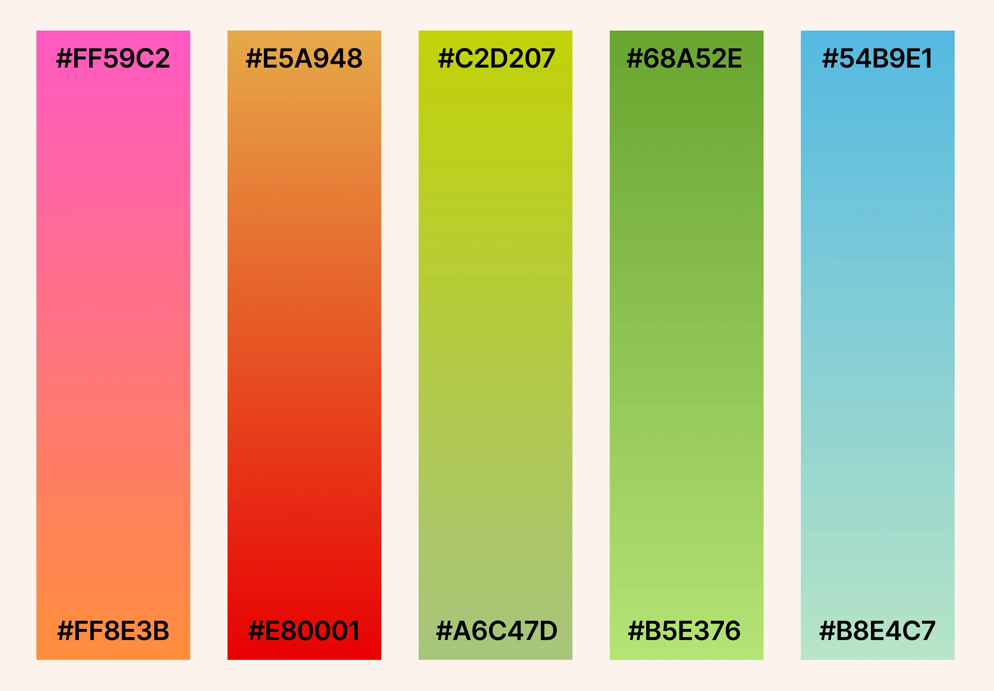
Swatches: #FF59C2 to #FF8E3B · #E5A948 to #E80001 · #C2D207 to #A6C47D · #68A52E to #B5E376 · #54B9E1 to #B8E4C7
The bright gradient palette is unashamedly bold. Spanning a vivid spectrum from hot pink and coral orange through acid chartreuse, fresh grass green, and electric sky blue, these are gradients that make an immediate statement. They communicate energy, creativity, and confidence; qualities that are increasingly valued in a crowded digital landscape where websites have, at most, a matter of seconds to capture attention.
In 2026, this kind of dopamine-driven colour palette has found significant traction in consumer-facing design. Design commentators point to the influence of Y2K nostalgia and what has been termed "dopamine design": the deliberate use of saturated, high-energy colour to create a positive emotional response in the user. Neon gradients and high-contrast pairings are appearing across SaaS landing pages, food and drink brands, fitness platforms, and youth-focused retail, replacing the timid, monochrome aesthetic that preceded them.
The key to using bright gradients effectively lies in contrast and restraint. Research from the Nielsen Norman Group confirms that high-contrast colour combinations improve readability and user engagement, provided they are applied with intention. A vibrant gradient creates immediate visual drama while still allowing clean white or dark typography to sit clearly above it. The danger lies in applying saturated colour everywhere; when everything is bold, nothing stands out. Bright gradients work precisely because they are used as a focal point, not a wallpaper.
For brands in the creative industries, technology, events, or health and wellness, a bright gradient system signals modernity, approachability, and ambition. Used on hero images, call-to-action sections, or interactive UI elements such as buttons and hover states, they inject personality and drive engagement without compromising usability.
Palette Two: Pastels
Warmth, Trust, and Considered Refinement
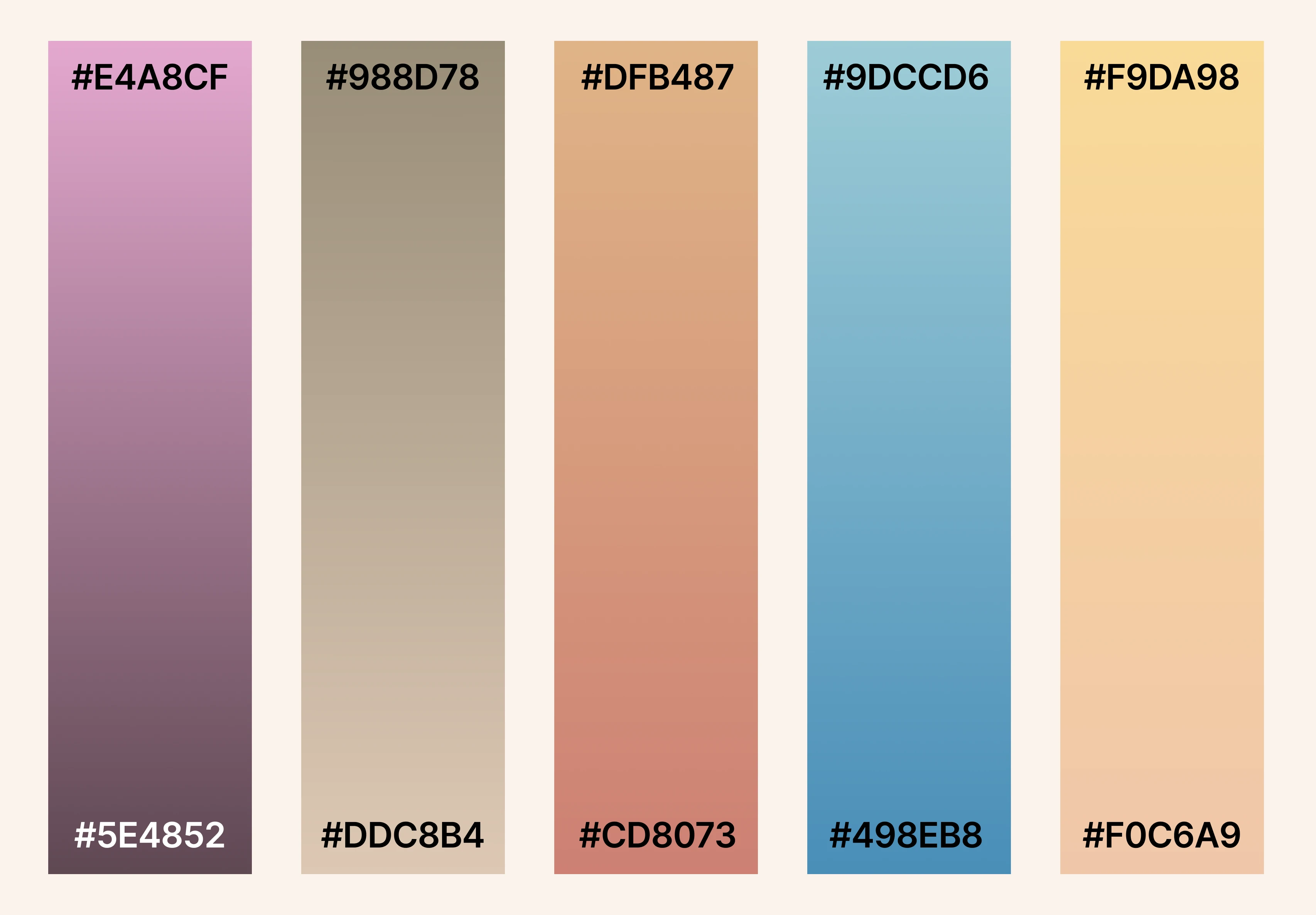
Swatches: #E4A8CF to #5E4852 · #988D78 to #DDC8B4 · #DFB487 to #CD8073 · #9DCCD6 to #498EB8 · #F9DA98 to #F0C6A9
Where the bright palette commands attention, the pastel gradient palette earns trust. Drawing from a considered range of muted mauve and dusty plum, warm taupe and sand, terracotta and blush, soft steel blue, and honeyed cream, these gradients speak the visual language of calm, quality, and care. They are, in many respects, the gradient expression of Pantone's 2026 Colour of the Year, Cloud Dancer: a soft, airy neutral that signals clarity and reset in a world of over-stimulation.
Pastel gradients have become particularly prominent in sectors where trust and approachability are paramount. Healthcare, wellness, beauty, financial services, and professional consultancy brands are all embracing muted, sophisticated blends that feel warm without being saccharine. Design industry analysts describe this aesthetic as "quiet confidence"; a way of conveying premium quality without resorting to the aggressive contrast of brighter palettes.
One of the most compelling uses of pastel gradients in 2026 is in what designers are calling "cosmic gradients": layered, iridescent blends that suggest depth and translucency. Inspired in part by the liquid glass aesthetic introduced with Apple's iOS 26 in mid-2025, these ethereal transitions feel simultaneously futuristic and tactile. Applied to website backgrounds, section dividers, or subtle UI overlays, they create a sense of depth and polish that elevates the overall perception of a brand without demanding the user's full attention.
From a practical standpoint, pastel gradients also offer significant accessibility advantages. The gentler contrast ranges mean that typography placed over them is easier to manage, and when combined with careful colour token management for both light and dark modes, they scale elegantly across a full digital ecosystem, from desktop browsers to mobile applications. For businesses that need their website to feel genuinely human and considered, this palette is an exceptionally versatile foundation.
Palette Three: Depth
Authority and Sophisticated Presence
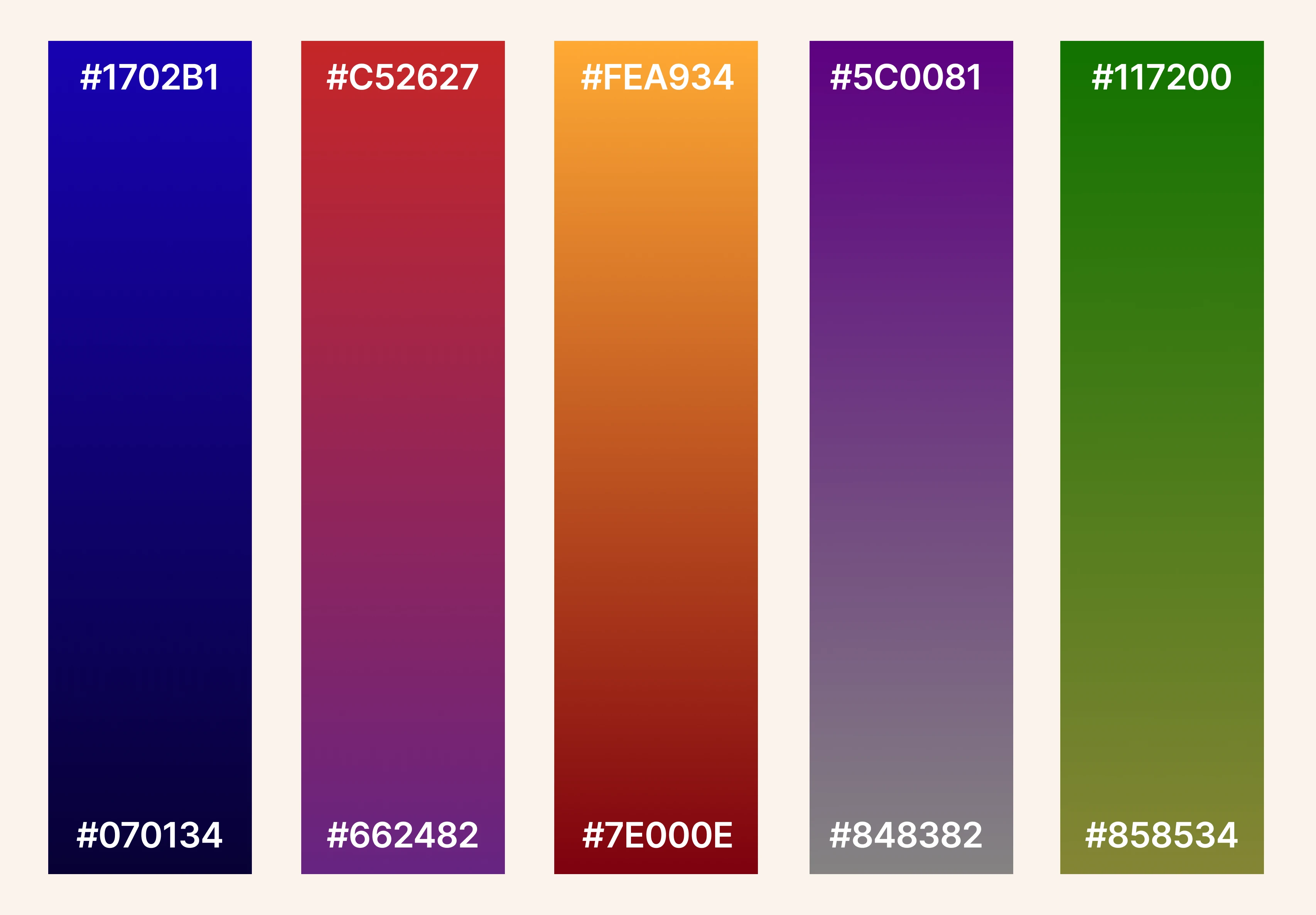
Swatches: #1702B1 to #070134 · #C52627 to #662482 · #FEA934 to #7E000E · #5C0081 to #848382 · #117200 to #858534
The dark gradient palette is where colour becomes truly cinematic. Deep cobalt blue dissolving into near-black, crimson bleeding into aubergine, amber burning down to a dark wine, purple fading to granite grey, and forest green settling into olive: these are gradients that communicate authority, sophistication, and depth. They are the palette of brands that want to own the room.
Dark gradients have evolved considerably in 2026. Where dark mode was once treated as a simple colour inversion, the design community has recognised that truly effective dark interfaces require their own dedicated palette, one built from the ground up with dark surfaces, rich colour transitions, and carefully managed contrast. This approach, described by UI analysts as "mood mode" design, treats the dark canvas as an opportunity for genuinely dramatic visual expression, rather than a mere accessibility toggle.
The use of deep, saturated gradient systems is particularly strong in technology, luxury goods, entertainment, cybersecurity, and professional services; sectors where gravitas matters and where visitors arrive expecting to be impressed. A deep indigo-to-black gradient in a hero section, overlaid with crisp white typography, immediately positions a brand as authoritative and forward-thinking. The warm amber-to-crimson transition evokes energy and passion without the playfulness of brighter tones. The purple-to-grey fade creates an intriguing sense of mystery that works particularly well for creative agencies and digital product companies.
Dark gradients also have a compelling practical argument in their favour. Research consistently shows that OLED screens, now dominant across high-end mobile devices and increasingly common on desktop monitors, render deep, dark colours with exceptional richness, making true blacks and near-black gradients appear more vivid and premium than they would on older LCD displays. Designing with dark gradient systems is, in part, designing for the hardware your audience is actually using. Combined with the broader 2026 trend towards grain overlays and textured noise effects, which add warmth and tactility to what might otherwise feel sterile, dark gradients can produce some of the most memorable and distinctive digital experiences available to designers today.
Choosing the Right Gradient Voice for Your Brand
Gradients are no longer a stylistic afterthought or a nostalgic throwback. In 2026, they are a primary design language, one that communicates brand personality, shapes emotional response, and creates the kind of depth and atmosphere that static colour cannot achieve. The key insight from this year's design landscape is that the gradient trend has matured into something intentional and brand-specific: the best agencies are not simply reaching for a generic blend, but building gradient systems that are as uniquely theirs as a typeface or a logo.
Whether you choose the vibrant immediacy of the bright palette, the considered warmth of pastels, or the commanding depth of dark tones, the principles remain consistent. Deploy gradients with purpose. Pair them with clean, confident typography. Ensure they meet accessibility standards for contrast. And, most importantly, resist the temptation to apply them everywhere; a gradient's power lies precisely in the contrast it creates against the cleaner, quieter elements that surround it.
At Accent, we believe great website design is always about solving real problems for real people while creating something genuinely beautiful. Colour, and the considered, skilled use of gradients, is one of the most powerful ways to achieve both at once. If you would like to explore how a bespoke gradient design system could elevate your brand's digital presence, we would love to hear from you.
Karen Fuller is the office manager and creative of Accent, based at the Enterprise Centre, University of East Anglia. She has worked in the reprographics and photography industries for 27 years, and holds a degree in fine art and qualifications & awards in photography and design.