By Karen Fuller, Office Manager & Creative, Accent
If you have ever sent artwork to a printer and got back something that looked flatter than the file on your screen, or watched a brand blue turn slightly purple on a leaflet, you have met the gap between how screens make colour and how ink makes colour.
Three acronyms sit at the centre of that gap: RGB, CMYK and LAB. They get thrown around in design briefs, print specs and brand guidelines as though everyone already knows what they mean. Most people do not, and there is no reason they should.
I learned about colour the slow way. My career started at a printers in Norfolk, operating drum scanners: mounting transparencies on a rotating cylinder, spinning them at speed past a photomultiplier tube, and separating images into four plates for litho printing the promotional brochures. If a conversion was wrong, you did not find out from a warning dialogue. You found out from a wet proof, or worse, from 10,000 printed brochures. That teaches you very quickly that colour is not a fixed property of an image. It is a negotiation between what the eye can see, what the device can make, and how carefully you managed the journey between them.
This guide covers what each of the three actually is, when to use it, and the one concept that makes all of it click.
First, the thing nobody tells you
Colour is not really in the object. It is a sensation produced in your visual system when light of certain wavelengths hits the cones in your retina and your brain interprets the result.
That matters practically, because it means no device produces "the colour". A screen and a printed page use completely different physics to trigger a similar sensation, and they each fail in different places. Colour spaces exist to manage that failure predictably.
Two ways of making colour
Everything downstream comes from this one distinction.
Additive colour (screens). A screen starts black and emits light. Add red, green and blue light together and you get white. Turn everything off and you get black. More light, brighter colour.
Subtractive colour (print). A printed page starts white and reflects the light in the room. Ink does not add anything; it absorbs, or subtracts, wavelengths. Cyan ink absorbs red light, magenta absorbs green, yellow absorbs blue. Pile on more ink and you get closer to black, and closer to a muddy, saturated mess.
Screens are working with light. Print is working with what is left of the light after the ink has taken its share. That is why a screen can make a colour glow and a page never can.
RGB: the colour of light
RGB stands for Red, Green, Blue. Each channel typically runs from 0 to 255, giving roughly 16.7 million combinations in 8 bit. The hex codes you see in web design are just RGB written in base 16: #4C2DE7 is 76 red, 45 green, 231 blue.
The important detail almost everyone misses is that "RGB" on its own does not specify a colour. It specifies three ingredient amounts. What colour those amounts produce depends entirely on how red, green and blue are defined for that particular device. That definition is the colour space, and there are several:
- sRGB is the default of the internet. It was standardised in 1996 and it is what browsers, most consumer screens and almost all web content assume. It is the safe choice for anything digital.
- Display P3 is noticeably wider, particularly in reds and greens. Apple hardware has used it since 2015 and it is gradually arriving on the web.
- Adobe RGB (1998) was designed to cover more of what a printing press can achieve, especially in cyans and greens. It is a photography and pre-press working space, not a delivery space.
When to use RGB
Anything that will be viewed on a screen. Websites, apps, email, social media, video, digital advertising, presentations, screen-based signage. Export as sRGB unless you have a specific, colour-managed reason not to.
The RGB mistake to avoid
Sending an untagged RGB file, or an Adobe RGB file, to the web. Without an embedded profile, software guesses, and the guess is usually sRGB. An Adobe RGB image displayed as though it were sRGB looks washed out and slightly grey. Always export web images as sRGB with the profile embedded.
CMYK: the colour of ink
CMYK stands for Cyan, Magenta, Yellow and Key. Key is black, and it is called Key because it is the plate the other three are keyed to, or registered against, on press. Black gets its own ink because mixing cyan, magenta and yellow to make black is expensive, unreliable, slow to dry and produces a brownish sludge rather than a proper black.
CMYK is even more device dependent than RGB, because a CMYK number is only meaningful alongside a press, an ink set and a paper stock. The same values printed on gloss coated stock and uncoated stock will not look the same, because uncoated paper absorbs ink and scatters light.
That is what CMYK profiles describe. In the UK and Europe you will most often meet FOGRA39 / ISO Coated v2 for coated stock and PSO Uncoated for uncoated. In North America the equivalents are GRACoL and SWOP. Your printer will tell you which one they work to. Ask them, because it changes the numbers.
Two other practical points from the pressroom:
- Total ink limit. Most coated litho work caps total ink coverage at around 300 to 330 per cent. Exceed it and ink will not dry, sheets set off against each other, and the job is spoiled.
- Rich black versus 100K. Small text should be 100 per cent black only, so it stays sharp and does not need four plates to register perfectly. Large solid areas need a rich black build, adding cyan, magenta and yellow underneath, or they look washed out and grey. Read our article on the variety of blacks.
When to use CMYK
Commercial litho and offset printing, and most digital presses: brochures, packaging, business stationery, magazines, exhibition graphics, anything with a press behind it. Convert to CMYK at the end of the process, using the profile your printer specifies.
The CMYK mistake to avoid
Designing in CMYK from the start because the job is a print job. You lock yourself into a narrower set of colours before you need to, you lose editing headroom, and the moment the client asks for a web version you have to convert back out of a space you already threw information away in. Work in RGB, soft proof in CMYK, convert last.
The exception: when print asks for RGB
"RGB for screen, CMYK for print" is a sound rule for commercial litho. It is not a law of nature, and digital presses regularly break it. Plenty of printers will ask you for RGB files, and it is not a mistake on their part.
There are two reasons.
Their gamut is not offset's gamut. An HP Indigo running ElectroInk, a production toner press, or a wide format inkjet with six or eight inks does not have the same colour range as a litho press on coated stock. Some of those devices reach past traditional four colour process in places. If you convert to FOGRA39 first, you clip the file down to what a litho press could manage, and those colours are gone. The press cannot put back what you have already thrown away.
The RIP (Raster Image Processor) wants to do the conversion itself. A modern print workflow holds a profile for that specific press, ink, screening and stock combination, which is far more precise than any generic profile you have on your machine. Hand it RGB and it makes one accurate conversion. Hand it CMYK and it either passes your ink values straight through, whatever they happen to look like on that device, or converts a second time from a file that has already been squeezed once.
The underlying principle is the same one that governs everything else here: convert once, as late as possible, into the profile of the thing that will actually make the marks. Sometimes that profile lives in your software, and sometimes it lives in the printer's RIP. Only they know which.
What to do about it
- Ask, every time, and get it in writing. Which colour space, which profile, which PDF standard. A decent printer has a spec sheet and will be pleased you asked.
- Mind the PDF flavour. PDF/X-1a is CMYK only and flattens transparency, so it cannot carry an RGB workflow. PDF/X-4 supports tagged RGB content and live transparency, which is why RGB-friendly digital workflows usually ask for it.
- Watch your blacks. This is the one that bites. Black text built as RGB 0,0,0 can come out of a careless RIP as a four colour black. On body copy that means any tiny misregistration shows as colour fringing on the letterforms, and the type looks soft. If you are supplying RGB, confirm the workflow preserves pure black, or supply text elements as K-only.
- Protect tested brand builds. If you have a CMYK recipe for a brand colour that you know prints correctly, say so explicitly rather than letting it be converted and reconverted on the way through.
Desktop inkjets follow the same logic, incidentally. They contain CMYK inks, and often more, but the driver expects RGB and does its own conversion internally. Sending a CMYK file to a desktop inkjet usually makes the result worse, not better.
LAB: the colour of perception
LAB, properly written CIELAB or L*a*b*, is the odd one out, and it is the one that makes the other two make sense.
RGB and CMYK describe how a device makes a colour. LAB describes what a colour actually is, independently of any device. It was defined by the CIE, the International Commission on Illumination, and it is built from measurements of human vision rather than from hardware.
It has three axes:
- L* is lightness, from 0 (black) to 100 (white).
- a* runs from green (negative) to red (positive).
- b* runs from blue (negative) to yellow (positive).
Those two colour axes are not arbitrary. They mirror the opponent process in human vision: we perceive colour in red-versus-green and blue-versus-yellow pairs, which is why you can imagine a reddish yellow but not a reddish green.
LAB was also designed to be roughly perceptually uniform, meaning a given numerical distance corresponds to a similar amount of visible difference wherever you are in the space. That property is what makes it measurable, and it gives us Delta E, the standard unit of colour difference. As a rough guide, using the modern CIEDE2000 formula:
| Delta E 2000 | What it means |
|---|---|
| Under 1 | Not perceptible, even side by side |
| 1 to 2 | Perceptible to a trained eye on close inspection |
| 2 to 3.5 | Noticeable at a glance |
| Over 5 | Read as two different colours |
Where you actually meet LAB
You rarely design in LAB, and that is fine. But it is quietly running underneath everything:
- Every ICC colour conversion goes through it. When Photoshop converts sRGB to FOGRA39, it does not go directly. It converts into a device independent Profile Connection Space, which is LAB or its close relative XYZ, and back out again. LAB is the pivot language.
- Pantone publishes spot colour values in LAB, because a spot colour is a specific physical ink, not a mix of process inks, and LAB is the only honest way to define it.
- Delta E tolerances in print contracts are LAB measurements.
- Serious brand guidelines increasingly specify a master colour in LAB, then derive the sRGB, hex and CMYK versions from it, rather than machine converting one to another and hoping.
When to use LAB
As a specification and measurement space, not a design space. If a colour genuinely has to match across a website, a printed brochure and a vinyl wrap, define it in LAB or as a Pantone reference and derive each output from that master.
The concept that ties it together: gamut
Gamut is simply the range of colours a given space or device can actually produce. Every device has one, and every device's is smaller than what your eye can see.
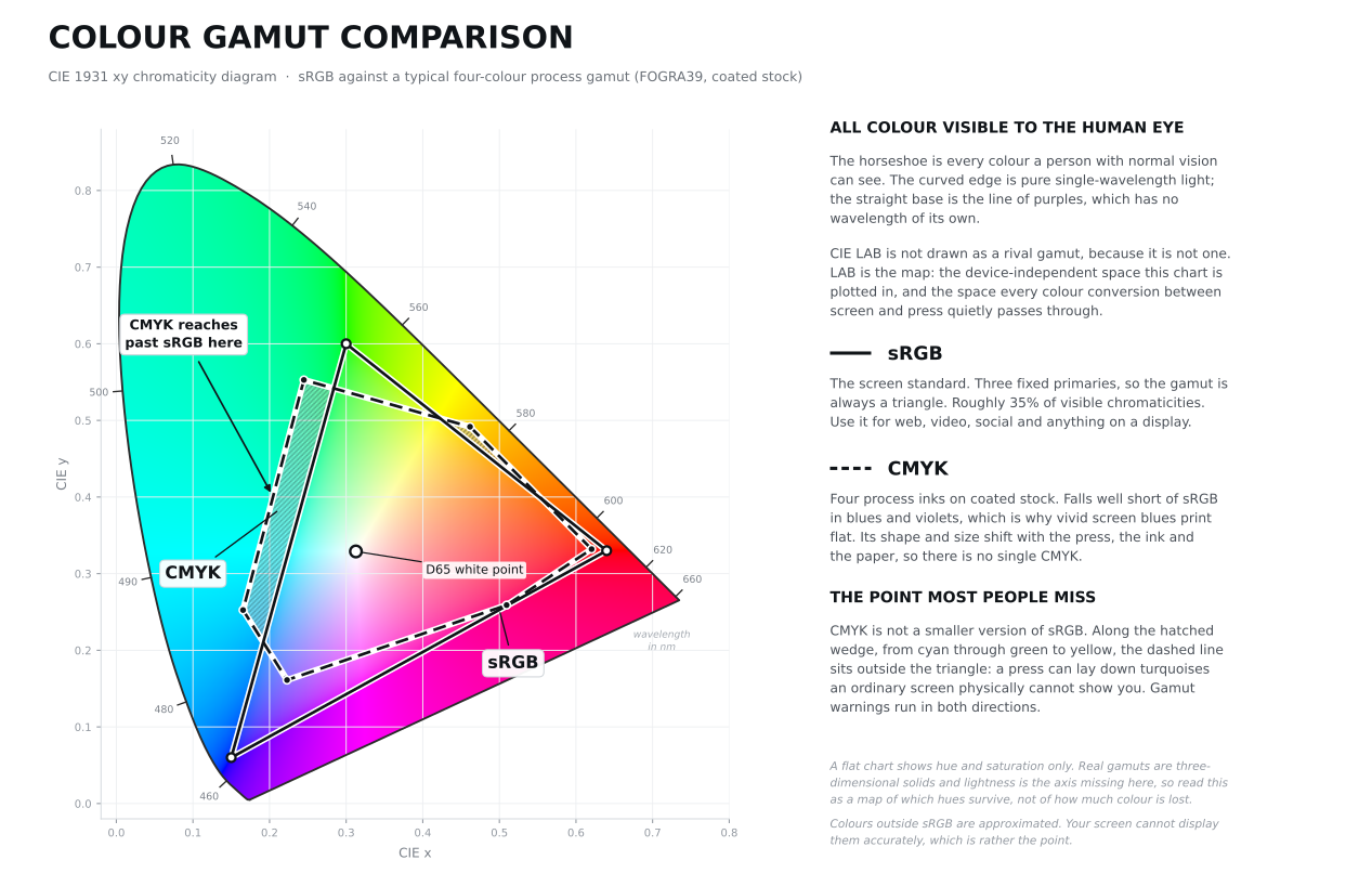
The CIE 1931 xy chromaticity diagram: the horseshoe is everything the human eye can see, the solid triangle is sRGB, and the dashed shape is a typical four-colour process gamut on coated stock. Note the hatched wedge, where CMYK reaches past sRGB in the cyans and greens.
The horseshoe outline is not a stylistic choice. Its curved edge is the spectral locus, the trail of pure single-wavelength light from violet at around 380 nanometres round to red at 700, and the straight line closing the bottom is the line of purples, colours we see but that no single wavelength produces. sRGB is a triangle because it is built from exactly three fixed primaries, and you cannot make a shape with more corners than you have inks or phosphors. CMYK has more corners because it has more inks.
The commonly quoted figures are that sRGB covers roughly 35 per cent of the colours a human can distinguish, and a typical four colour process gamut around 20 per cent. Treat both as useful orders of magnitude rather than precise measurements, for two reasons. First, they are usually calculated as areas on the CIE 1931 chromaticity diagram, which exaggerates the green region. Second, and more importantly, gamuts are three dimensional solids, and a flat diagram throws away the lightness axis entirely. A space can look wide on the chart and still be poor at pale tints or deep shadows.
The point that even experienced designers get wrong is the assumption that CMYK is just a smaller RGB. It is not a subset. Process inks fall a long way short of screen colours in vivid blues, violets, oranges and bright greens. But cyan and turquoise run the other way: a press can lay down turquoises that an sRGB screen physically cannot show you. That is why gamut warnings run in both directions, and why a client's "that turquoise looked better in the brochure" is sometimes literally true.
LAB does not really belong on this chart as a competing gamut, because it is not one. It is the map the other two are drawn on.
A real example: the Babiana rubrocyanea problem
Babiana rubrocyanea, the wine cup babiana, is a Cape wildflower with an intense violet-blue petal and a blood red throat. It sits almost perfectly on the boundary that separates screen colour from print colour, which makes it a useful test case. I recently had the pleasure of converting this for a holiday brochure, and what started as a punchy colourful flower, soon turned into a flat mess.

The original, in sRGB.

The same image converted to a CMYK process gamut and brought back to sRGB so it can be shown on screen. This is a simulation of print, not print itself.
I measured the difference between the two versions rather than eyeballing it. Isolating the blue petal pixels and converting both to LAB gives this:
| Original (sRGB) | After CMYK conversion | |
|---|---|---|
| Average petal colour | #4C2DE7 | #5253A3 |
| L* (lightness) | 37.1 | 39.1 |
| a* | 62.7 | 22.3 |
| b* | -86.4 | -43.6 |
| C* (chroma, or saturation) | 106.7 | 48.9 |
| Hue angle | 305.9° | 297.1° |
The petals lost 54 per cent of their chroma. The average colour difference across them is a Delta E 2000 of 12.6, peaking at 16.8. Anything above 5 reads as a different colour, so this is not a subtle shift; it is a different flower.
Three details are worth pulling out:
The blue got lighter as it got duller. L* rose from 37.1 to 39.1. There is no ink combination that produces a deep violet-blue that is simultaneously that dark and that saturated, so the conversion trades depth for the closest available hue.
The hue rotated by about 9 degrees. The colour did not just fade, it moved. That is the signature of gamut clipping: the colour is dragged to the nearest point on the boundary of what ink can do, and the nearest point is rarely straight inwards.
The rest of the image barely moved. The red throat shifted by a Delta E 2000 of just 1.4, effectively invisible. The green foliage moved 2.9. Across the whole image the median difference was 0.9, which is below the threshold of perception. Only about one pixel in nine changed enough to be obviously different, and almost all of them were blue.
That is the honest picture of an RGB to CMYK conversion. It is not a general dulling of everything. Most of the image survives intact, and one specific range of colours collapses. Which is exactly why the problem catches people out: it is invisible until it lands on the one element that mattered, which is usually the brand colour.
A note on the second image: because you are reading this on a screen, that "CMYK" version has been converted back into sRGB. It is the best available on-screen approximation of the print result. The actual printed piece would differ again depending on press, ink and paper.
What to do about it in practice
Work in RGB, convert at the end. Keep your headroom for as long as possible. Convert to the specific CMYK profile your printer asks for, as the last step before supplying artwork.
Soft proof before you commit. In Photoshop, View > Proof Setup > Custom, select your printer's profile, then View > Proof Colours. Turn on View > Gamut Warning to see exactly which areas will not survive. Do this early, while you can still choose a different photograph or adjust the artwork deliberately rather than letting an algorithm decide.
Understand rendering intents. When you convert, you choose how out of gamut colours are handled. Relative colorimetric keeps in-gamut colours exactly where they are and clips the rest to the boundary, which is right for logos, flat colour and most graphics. Perceptual compresses the whole image inwards to preserve the relationships between colours, which is usually better for photographs with a lot of out of gamut content, like our flower. Leave black point compensation on for relative colorimetric. If you are not sure, produce both and look at them.
If a colour really matters, do not let it be a process colour. A vivid brand blue that cannot survive CMYK is a case for a spot ink, a fifth colour, or a design decision to use the colour differently in print. That is a conversation to have at the design stage, not at artwork stage.
Get a proof, on the actual stock. Screens lie in small ways even when calibrated. A contract proof, or better a wet proof on the specified paper, is the only thing you can genuinely sign off against.
Calibrate your monitor. If you make colour decisions professionally, a hardware calibrator is not an indulgence. Without one you are guessing, and so is everyone you send files to.
Define brand colours once, properly. Master value in LAB or as a Pantone reference, with tested sRGB, hex and CMYK builds derived from it and written into the brand guidelines. Never let each supplier machine convert their own version.
Quick reference
| RGB | CMYK | LAB | |
|---|---|---|---|
| How it makes colour | Adds light | Subtracts light with ink | Describes perception |
| Starts from | Black | White paper | Nothing, it is a measurement |
| Device dependent? | Yes | Yes, very | No |
| Gamut | Medium, wide in blues and greens | Smallest, but wider in cyan | Covers all human vision |
| Use it for | Screens, web, video, social, and some digital press workflows | Litho and offset, plus any press that asks for it | Specifying, measuring, converting |
| Typical profiles | sRGB, Display P3, Adobe RGB | FOGRA39, PSO Uncoated, GRACoL | CIELAB (D50) |
Common questions
Why does my print always look duller than my screen? Because your screen emits light and paper only reflects it, and because the ink set cannot reach the most saturated blues, violets and greens your screen can. The fix is not to turn the saturation up; it is to soft proof and make deliberate choices about what to sacrifice.
Should I just design everything in CMYK to be safe? No. You throw away colour information you may need later, and you make the digital version of the job worse for no benefit. Design in RGB, proof in CMYK, convert last.
My printer has asked for RGB files. Are they wrong? Almost certainly not. Digital presses and wide format inkjets often have a colour range that differs from litho, and their RIP holds a profile for that exact press and stock. Giving them RGB means the file is converted once, accurately, instead of being squeezed into a generic CMYK profile first. Follow their spec, and check how the workflow handles pure black text.
Is LAB better than RGB or CMYK? It is not competing with them. LAB describes colours; RGB and CMYK make them. You need all three, doing different jobs.
What Delta E should I ask for? For brand critical colour, a tolerance of Delta E 2000 of 2 or below is a reasonable ask on a good press with a good printer. Below 1 is achievable but expensive. Above 5 and you are looking at a different colour.
Why does my logo look different on my phone and my laptop? Different panels, different gamuts, different calibration, and possibly a missing colour profile in the exported file. Embed sRGB profiles in your web assets, and accept that some variation across uncalibrated consumer screens is unavoidable.
Can a printer produce colours my screen cannot? Yes, in the cyan and turquoise range, which is a genuine and frequently overlooked quirk of the two gamuts. It is one of several reasons Adobe RGB exists as a working space for print photography.
About the author
Karen Fuller is the Creative at Accent, a digital agency established in 1990 specialising in web design, WordPress and custom software development. She began her career at a Norfolk printers, operating drum scanners to digitise transparencies for the estate agency litho brochure sector, where she learned colour management the practical way: on press, on paper, with the proofs in front of her. She now applies the same discipline to digital work, where accessible contrast, accurate brand colour and consistent cross-media reproduction matter just as much and are just as easy to get wrong. She also still designs for print.
A Note on How This Article Was Produced
The editorial position taken here is Karen Fuller's own, drawn from more than two decades of hands-on work in print reprographics and design. AI tools were used to help summarise research and to shape the author's views into a working draft. Every claim was verified, and the final text was reviewed and edited by a person, who takes responsibility for it.