By Karen Fuller, Office Manager & Creative, Accent
Ask most people to name a brand they trust and they will usually picture it before they can explain why. A colour, a shape, the way a headline is set, the particular way a company "sounds" when it speaks to them. That instant recognition is not luck. It is the result of consistency, repeated patiently over months and years until it becomes second nature to the audience.
In nearly three decades of working with print, photography and design, I have seen the same pattern again and again. The businesses that grow their reputation are rarely the ones with the flashiest logo. They are the ones that show up in the same way, every time, everywhere.
In this article I want to look at consistency from a marketing point of view, covering three areas that I believe matter most:
- Consistency of brand identity: logo, colours and typography
- Consistency of social media activity
- Consistency of tone of voice, whoever is doing the writing
Why Consistency Matters
Every time someone encounters your business, whether it is a website visit, a LinkedIn post, a printed brochure or an email, they form a small impression. On its own, one impression is easily forgotten. Repeated and reinforced, those impressions build familiarity, and familiarity builds trust.
Inconsistency works in the opposite direction. When a logo appears in three slightly different colours, when the website uses one typeface and the brochure another, or when the social media feed goes quiet for two months and then posts five times in a day, the audience notices, even if only subconsciously. The message they receive is that the business is not quite sure of itself. That is a difficult impression to shake.
Consistency also saves time and money. When decisions about colour, type, layout and voice have already been made and written down, nobody has to reinvent them for every new piece of work. Designers, writers and suppliers can get on with producing good work instead of debating the basics.
Part One: Consistency of Brand Identity
Your logo
Your logo is the most recognisable single element of your brand, so it deserves the most protection. In my experience, the problems rarely come from the logo itself. They come from how it is used. Common issues include:
- Stretching or squashing the logo to fit a space
- Recreating it from a low resolution screenshot rather than using the master artwork
- Placing it on busy backgrounds where it loses clarity
- Adding effects such as drop shadows or outlines that were never part of the design
- Using out of date versions long after a refresh
The fix is straightforward. Keep a central, well organised set of logo files in the correct formats (vector files for print and scalable use, optimised files for web), with clear rules on minimum sizes, clear space around the logo and approved colour variations such as full colour, single colour and reversed out.
The page below, taken from Accent's own brand guidelines, shows how we define our logo system. Every approved version is drawn on a construction grid, so whoever picks up the files, the proportions and spacing never change.
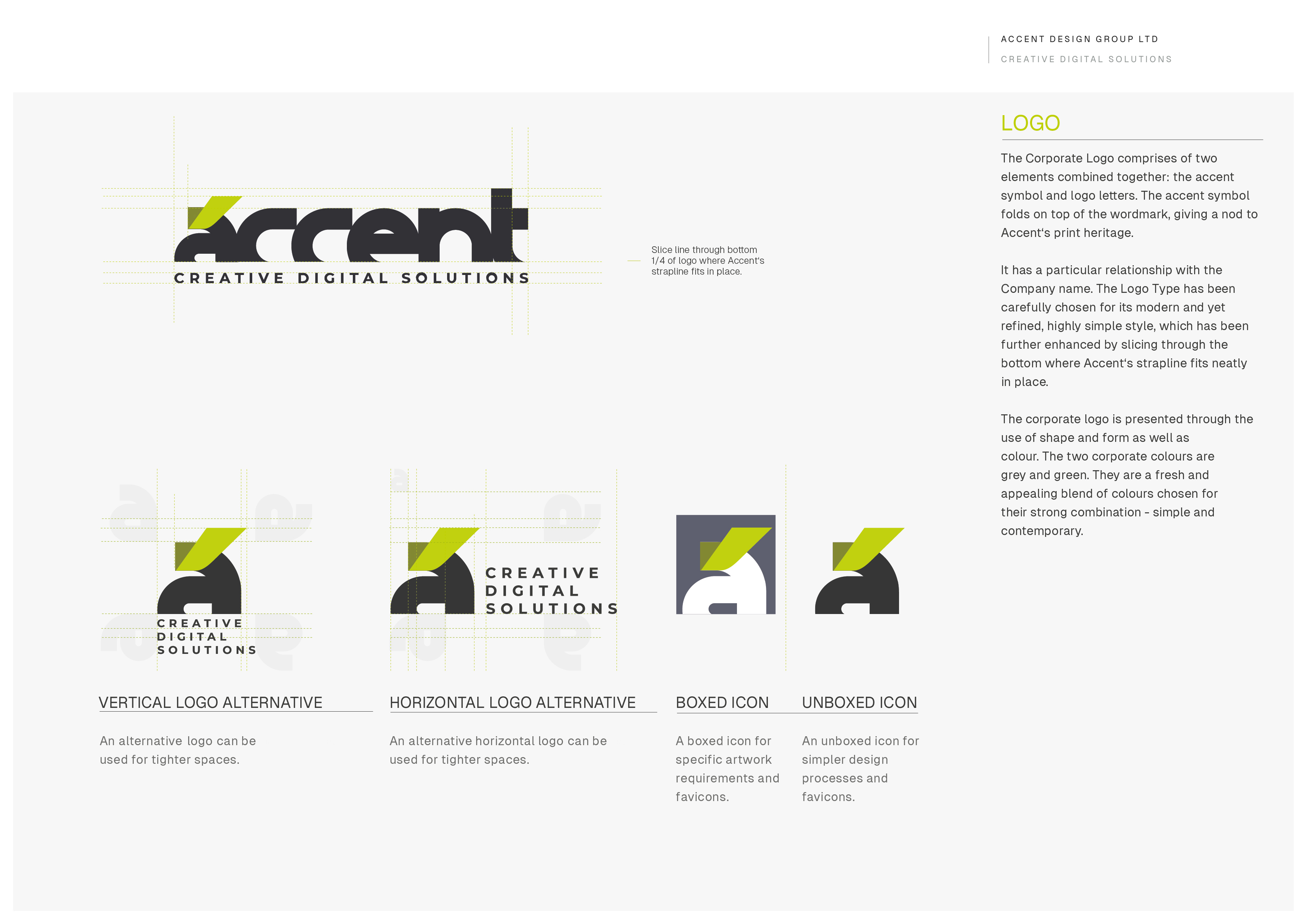
Accent's logo system, from our brand guidelines. Defining every approved version, from the full logo to the small icon used for favicons and social profiles, means the right version is always to hand and nobody has to improvise.
Your colours
Colour is one of the fastest ways people recognise a brand, and it is also one of the easiest things to get wrong. Coming from a reprographics background, I have lost count of the times I have seen a brand colour look perfect on screen and noticeably different in print, or vary from one printer to the next.
This happens because screens and printing presses reproduce colour in fundamentally different ways. Screens use light (RGB), while print uses inks (CMYK), and specialist print may use spot colours such as Pantone. A consistent brand defines each of its colours in every system it needs:
- Pantone reference for spot colour print and signage
- CMYK values for standard printed materials
- RGB values for screen use
- HEX codes for websites and digital design
Defining these values once, properly, and making sure everyone uses them is one of the simplest and most effective things a business can do to look professional across every channel. It is also worth checking your colours for accessibility, so that text remains readable for people with visual impairments. Consistency and inclusivity should go hand in hand.
Your typography
Fonts carry personality. A traditional serif typeface feels very different from a clean, modern sans serif, and mixing too many styles quickly makes materials look cluttered and unplanned.
A good brand typically uses one or two typefaces, with a clear hierarchy for headings, subheadings, body text and captions. Just as importantly, it has sensible fallbacks. Not every font is available in every application, so it helps to specify an approved alternative for everyday documents such as letters, presentations and emails. Otherwise people will simply pick whatever is to hand, and consistency slips away one document at a time.
Your brand guidelines, and actually following them
All of the above belongs in one place: a set of brand guidelines. Sometimes called a brand book or style guide, this document is the single source of truth for how your business presents itself. A useful set of guidelines usually includes:
- The purpose and values behind the brand
- Logo files, variations and usage rules, including examples of what not to do
- Colour palette with Pantone, CMYK, RGB and HEX values
- Typefaces, hierarchy and approved fallbacks
- Photography and imagery style
- Layout principles and templates
- Tone of voice guidance (more on this below)
Creating guidelines is the easy part. The real challenge is sticking to them. I have seen many businesses invest in beautiful brand guidelines only to leave them sitting in a folder while staff, suppliers and freelancers carry on doing their own thing. A few practical habits help enormously:
- Make the guidelines easy to find. Share them with every member of staff and every supplier who produces work for you.
- Provide ready made templates. It is far easier to stay on brand when the starting point is already correct.
- Appoint a brand guardian. Someone who has the authority to say "that is not quite right" before work goes out.
- Review them regularly. Brands evolve, and guidelines should be updated deliberately rather than drifting by accident.
Guidelines are not about restricting creativity. In my experience they do the opposite. When the foundations are fixed, designers are free to be creative within a framework that keeps the brand recognisable.
Taking it further online: design systems
For businesses with a website, app or customer portal, brand guidelines can be extended into a design system. Where guidelines describe how the brand should look, a design system turns those rules into reusable, ready built pieces: buttons, forms, cards, navigation and page templates, each designed once and used everywhere.
The benefit is that consistency stops depending on memory and good intentions. A button looks and behaves the same on every page because it is the same button. It also brings practical advantages:
- Faster work. Designers and developers build new pages from tested components rather than starting from scratch.
- Built in accessibility. When a component is made accessible once, to WCAG 2.1 AA standards, every instance of it across the site benefits.
- Easier updates. Changing a colour or a component in one place updates it everywhere, instead of hunting through hundreds of pages.
Well known examples include Shopify's Polaris and Google's Material Design, both of which are documented publicly. You do not need anything on that scale, though. Even a small business benefits from a simple set of core styles and components that grows over time.
Part Two: Consistency in Social Media
Social media is often where brand consistency is tested hardest, because it demands a steady flow of fresh content, frequently produced under time pressure by different people.
Posting regularly
Consistency on social media is less about posting constantly and more about posting reliably. An account that posts twice a week, every week, will usually build a stronger relationship with its audience than one that posts every day for a fortnight and then disappears for a month.
Regular activity shows your audience that you are active, engaged and dependable. It also gives platforms more opportunities to show your content to the people who follow you. The right frequency depends on your audience, your resources and the platform, but whatever you choose, choose something you can sustain.
A content calendar is one of the most useful tools here. Planning themes, campaigns and key dates in advance takes the pressure off and makes it far less likely that your channels fall silent when things get busy.
Looking consistent
Every post is a small piece of your brand, so the visual rules from your guidelines should apply to social media too. Using consistent templates for graphics, quote cards, event announcements and news means your posts become recognisable in a crowded feed, often before anyone has read a word. Tools such as Canva can be set up with your brand colours, fonts and templates, making it easier for non designers to create on brand content.
Photography matters here as well. A consistent style of imagery, whether that is natural light, a particular colour treatment or a certain approach to composition, helps your feed feel like one coherent brand rather than a random collection of pictures.
Consistency does not mean every post has to look the same. The selection of Accent's own posts below covers very different subjects, from illustrated articles to new client work and a team photo, yet the same few rules hold them together.

A selection of Accent's Instagram posts. Each one places the Accent symbol in the same corner, picks up its colour from the image and uses the same two-weight headline style. Every post is also produced in both square and portrait formats, so it looks right wherever it appears.
Part Three: Consistency of Tone of Voice
Visual identity is only half of a brand. The other half is how it speaks. Tone of voice is the personality that comes through in your words: whether you sound warm or formal, playful or authoritative, technical or plain speaking.
One brand, many writers
In most businesses, content is written by lots of different people. Marketing might write the website copy, sales might write proposals, directors might write LinkedIn posts, and the support team might answer customer emails. Each person naturally has their own style. Without guidance, the brand ends up sounding like several different companies.
Your audience should not be able to tell who wrote something. They should simply recognise it as you.
Defining your voice
A tone of voice guide does not need to be complicated. It helps to describe your voice in three or four characteristics, with a short explanation of what each means in practice. For example, a brand might describe itself as:
- Knowledgeable, but never condescending. We explain things clearly without assuming the reader knows the jargon.
- Friendly, but professional. We are approachable, but we take our clients' work seriously.
- Confident, but honest. We are proud of what we do, and we do not overpromise.
Alongside this, practical rules make a real difference:
- Which spelling to use (UK or US English)
- Preferred words and phrases, and ones to avoid
- How to write the company name and product names
- How formal to be in different situations
- Rules for punctuation, capitalisation, numbers and dates
Tone can flex depending on the situation. A condolence message will naturally sound different from a celebratory social post. But the underlying personality should remain the same. Think of it like a person: you speak differently at a funeral and at a party, but you are still recognisably you.
Keeping everyone aligned
As with visual guidelines, a tone of voice guide only works if people use it. Sharing examples of good writing, offering a quick review process for important content and gently correcting inconsistencies all help build good habits across the team.
Common Pitfalls to Avoid
Having worked with many businesses on their branding, I see the same stumbling blocks come up time and again:
- Overcomplicating things. Guidelines that try to cover every possible situation from day one often go unread. Start with the essentials and build from there.
- No clear owner. If nobody is responsible for the brand, standards slowly drift. Someone needs the authority to keep things on track and approve changes.
- Not getting buy in. If the team does not understand why consistency matters, the guidelines will be seen as red tape. Involve people early and explain the reasoning, not just the rules.
- Forgetting maintenance. Brands evolve, platforms change and accessibility standards improve. Plan for regular reviews rather than letting the guidelines quietly go out of date.
How to Tell If It Is Working
Consistency can feel intangible, but there are practical ways to check whether your efforts are paying off:
- Regular brand audits. Gather a sample of recent materials, such as web pages, social posts, brochures and emails, and lay them side by side. Do they look and sound like the same business?
- Speed of production. New materials should become quicker to produce once templates and guidelines are in everyday use.
- Fewer corrections. The number of pieces sent back for being off brand should fall over time.
- Social media engagement. A steady posting rhythm should, over time, show in more stable reach and engagement.
- Audience feedback. Pay attention to what customers say. Comments such as "I knew it was you before I saw the name" are a sign that consistency is doing its job.
Bringing It All Together
Consistency is not glamorous. It rarely wins awards on its own, and it can feel repetitive to the people inside the business who see the same colours, fonts and phrases every day. But it is precisely that repetition that makes a brand memorable to everyone else.
If you take one thing from this article, let it be this: decide how your brand looks and sounds, write it down, share it with everyone, and then stick to it. Your audience will reward you with recognition, and recognition is the first step towards trust.
A quick consistency checklist
- Do you have up to date brand guidelines, and does everyone know where to find them?
- Are your logo files organised and available in the correct formats?
- Are your brand colours defined for print and screen, and do they look the same across both?
- Do you use a consistent set of typefaces with approved fallbacks?
- Do you have a realistic, sustainable social media posting schedule?
- Do your social media graphics follow a consistent template and style?
- Is there a tone of voice guide that everyone who writes for the business follows?
- Is someone responsible for checking that work stays on brand?
If you answered "no" or "not sure" to any of these, that is a good place to start.
About the author: Karen has worked in the reprographics and photography industries for 27 years. She holds a degree in Fine Art, along with qualifications and awards in photography and design, and leads the creative studio at Accent, a Norwich digital agency established in 1990.
A Note on How This Article Was Produced
The editorial position taken here is Karen Fuller's own, drawn from more than two decades of hands-on work in print reprographics and design. AI tools were used to help summarise research and to shape the author's views into a working draft. Every claim was verified, and the final text was reviewed and edited by a person, who takes responsibility for it.